ggsurveillance
Tools for Outbreak Investigation/Infectious Disease Surveillance
Create epicurves, epigantt charts, and diverging bar charts using 'ggplot2'. Prepare data for visualisation or other reporting for infectious disease surveillance and outbreak investigation (time series data). Includes tidy functions to solve date based transformations for common reporting tasks, like (A) seasonal date alignment for respiratory disease surveillance, (B) date-based case binning based on specified time intervals like isoweek, epiweek, month and more, (C) automated detection and marking of the new year based on the date/datetime axis of the 'ggplot2', (D) labelling of the last value of a time-series. An introduction on how to use epicurves can be found on the US CDC website (2012, < https://www.cdc.gov/training/quicklearns/epimode/index.html>).
ggsurveillance 



ggsurveillance is an R package with helpful tools and ggplot extensions for epidemiology, especially infectious disease surveillance and outbreak investigation. All functions provide tidy functional interfaces for easy integration with the tidyverse. For documentation and vignettes see: ggsurveillance.biostats.dev
Key Features
📊 Epidemic Curves
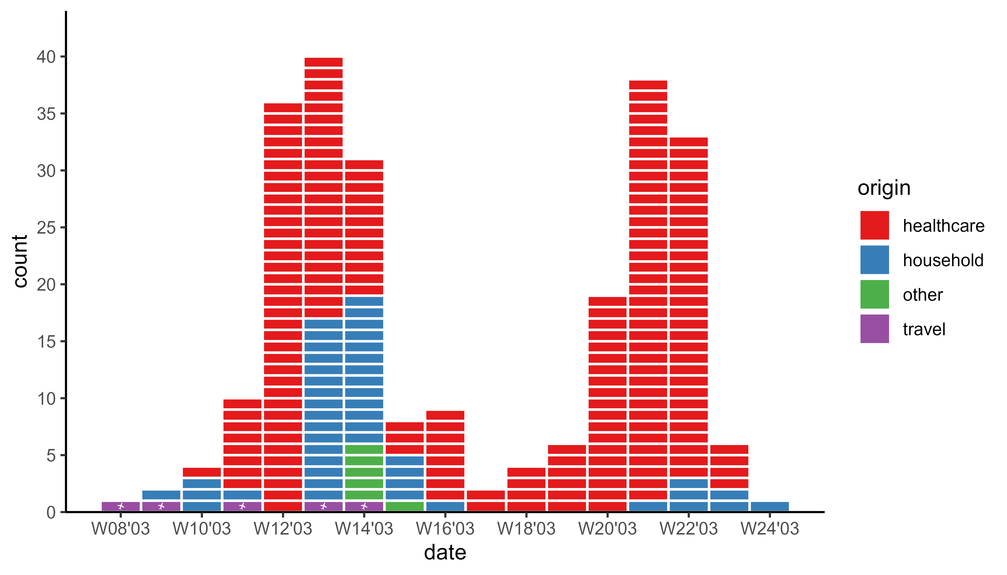
geom_epicurve(): A ggplot geom for plotting epicurves.stat_bin_date(): Date interval (week, month etc.) based binning of case numbers with perfect alignment with e.g. reporting week.geom_epicurve_text()andgeom_epicurve_point(): New geoms to easily add text annotations or points to cases in epidemic curves.geom_vline_year(): Automatically detects the turn of the year(s) from the date or datetime axis and draws a vertical line.scale_y_cases_5er(): For better (case) count axis breaks and positioning.
📅 Date & Time Transformations
-
bin_by_date(): Atidyverse-compatible function for flexible date-based aggregation (binning). -
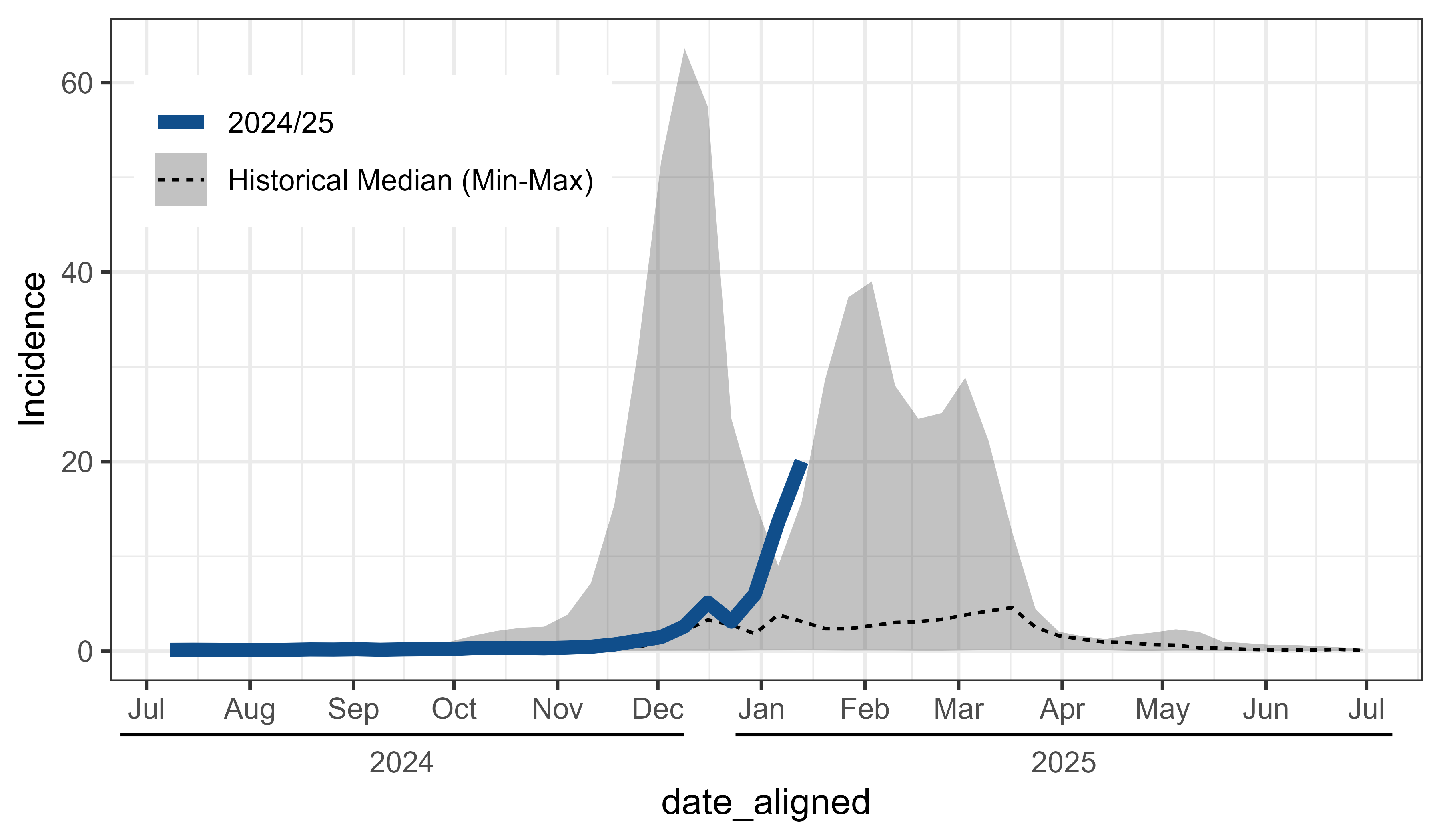
align_dates_seasonal(): Align surveillance data for seasonal plots (e.g. flu season).
📈 Specialized Epi Visualizations
-
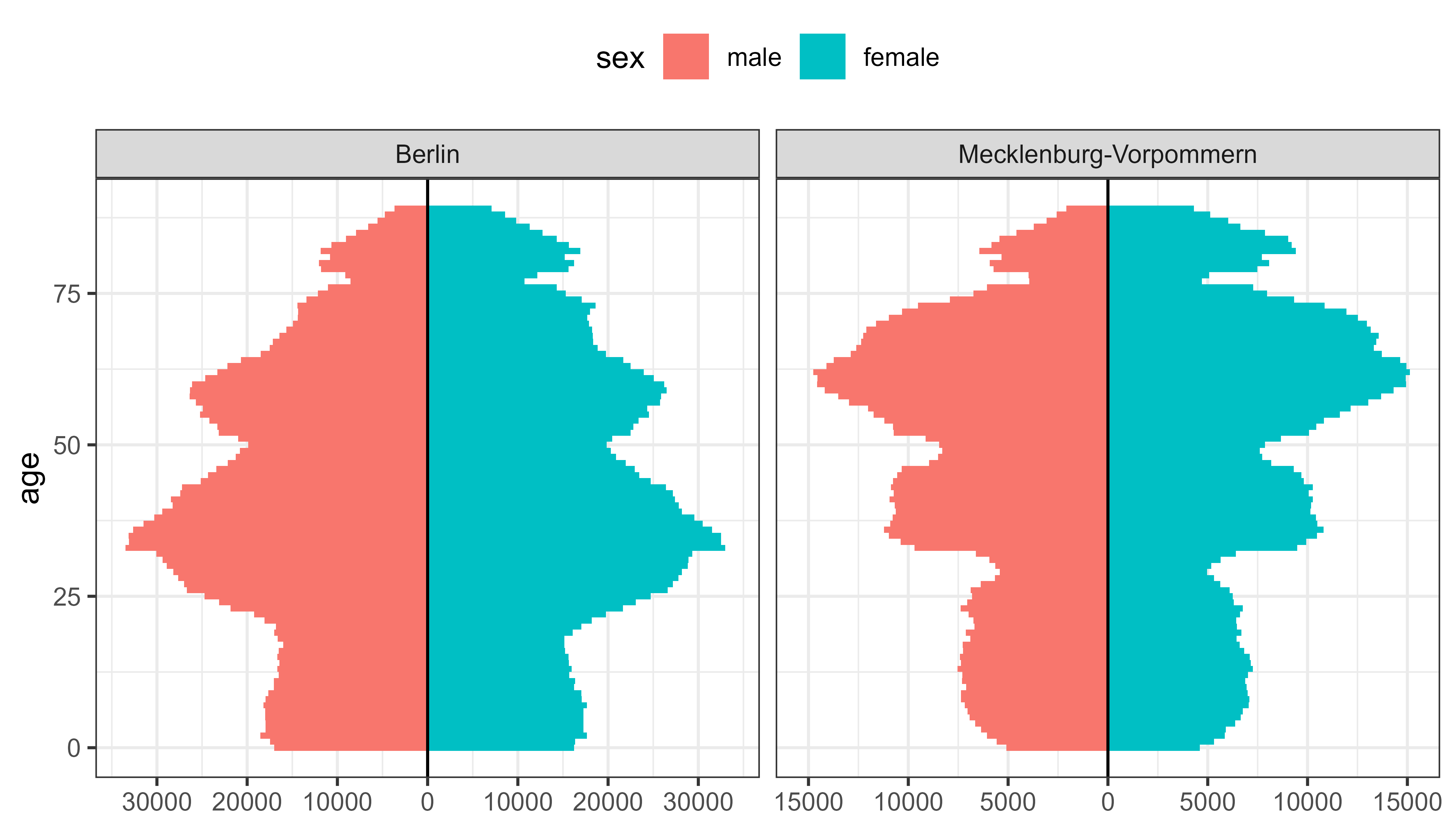
geom_bar_diverging(): A geom for diverging bar charts, which can be used to plot population pyramids, likert scales (sentiment analyses) and other data with opposing categories, like vaccination status or imported vs autochthonous (local) infections.stat_diverging()for easy labeling of these charts with category counts/percentages or total counts/percentagesscale_x_continuous_diverging()for symmetric diverging scalesgeom_area_diverging()for continuous variables (e.g. changes over time)
-
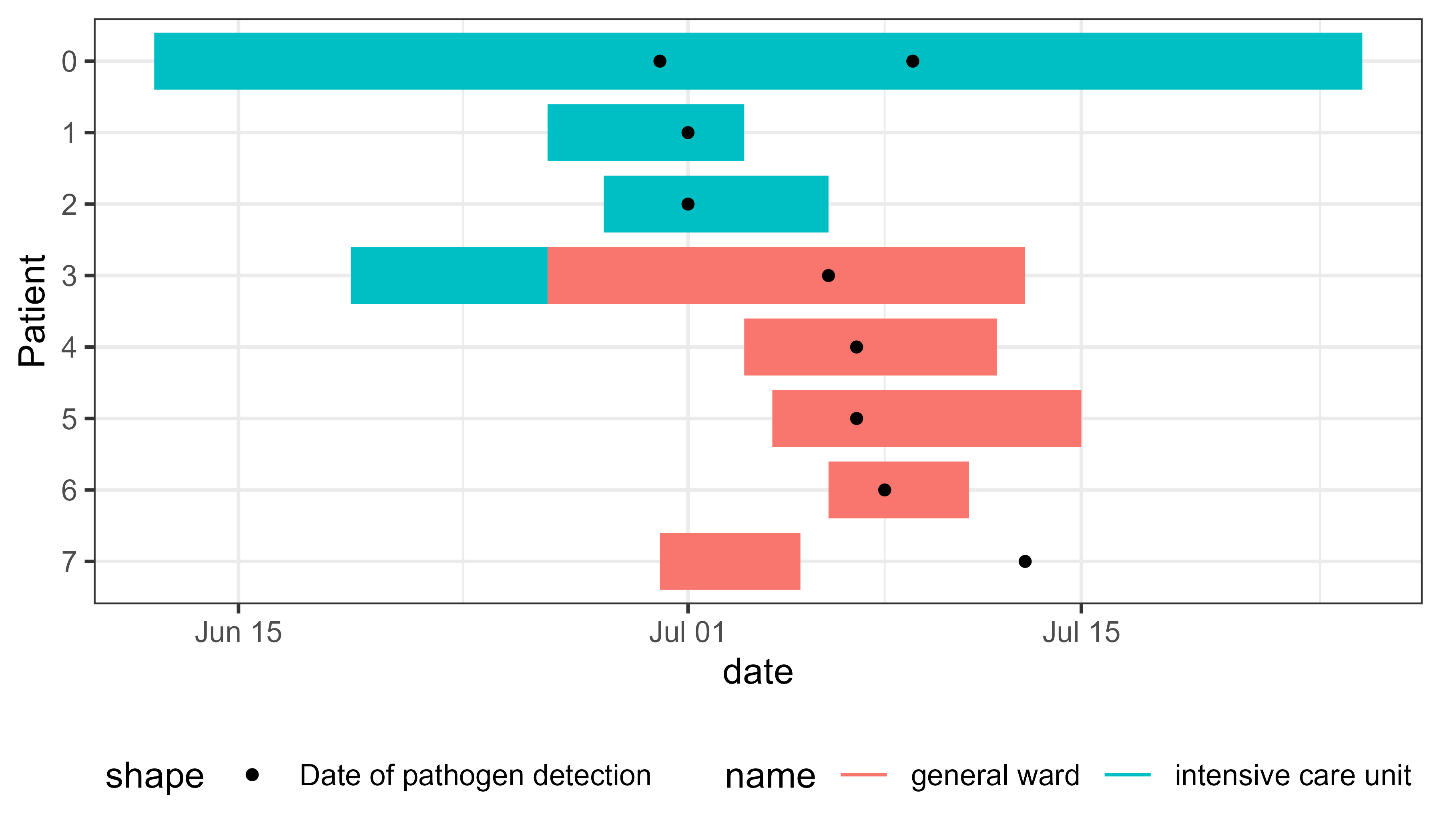
geom_epigantt(): A geom for epigantt plots. Helpful to visualize overlapping time intervals for contact tracing (e.g. hospital outbreaks).- including
scale_y_discrete_reverse()which reverses the order of the categorical scale.
- including
🎨 ggplot2 Extensions & Theme Modifications
-
More
ggplot2add-ons:guide_axis_nested_date(): An axis guide for creating nested date labels for hierarchical time periods (e.g., year > month > day).geom_label_last_value(): A geom for labeling the last value of a time series (e.g.geom_line()).label_power10(): Aggplot2-compatible labeling function to format numbers in scientific notation with powers of 10 (e.g., $2 \times 10^5$).
-
theme_mod_functions for ggplot2 theme modifications:theme_mod_legend_position()etc. to adjust the legend positions.theme_mod_rotate_x_axis_labels()etc. for rotating x axis labels.theme_mod_remove_minor_grid()etc. to remove the minor grid lines (x, y or both) or all grid lines.
🔧 Other Utilities
-
create_agegroups(): Create reproducible age groups with highly customizable labels. -
Additional utilities:
geometric_mean(),expand_counts(), and more
Examples
Creating Epicurves
library(ggplot2)
library(tidyr)
library(outbreaks)
library(ggsurveillance)

sars_canada_2003 |> #SARS dataset from outbreaks
  pivot_longer(starts_with("cases"),
               names_prefix = "cases_",
               names_to = "origin") |>
  ggplot(aes(x = date, weight = value, fill = origin)) +
  geom_epicurve(date_resolution = "week") +
  geom_epicurve_text(aes(label = ifelse(origin == "travel", "🛪", "")),
                     date_resolution = "week", size = 1.5, color = "white") +
  scale_x_date(date_labels = "W%V'%g", date_breaks = "2 weeks") +
  scale_y_cases_5er() +
  scale_fill_brewer(type = "qual", palette = 6) +
  theme_classic()
Align surveillance data for seasonal comparison
library(ggplot2)
library(dplyr)
library(ggsurveillance)

influenza_germany |>
  filter(AgeGroup == "00+") |>
  align_dates_seasonal(dates_from = ReportingWeek,
                       date_resolution = "isoweek",
                       start = 28) -> df_flu_aligned

ggplot(df_flu_aligned, aes(x = date_aligned, y = Incidence)) +
  stat_summary(
    aes(linetype = "Historical Median (Min-Max)"), data = . %>% filter(!current_season),
    fun.data = median_hilow, geom = "ribbon", alpha = 0.3) +
  stat_summary(
    aes(linetype = "Historical Median (Min-Max)"), data = . %>% filter(!current_season),
    fun = median, geom = "line") +
  geom_line(
    aes(linetype = "2024/25"), data = . %>% filter(current_season),
        colour = "dodgerblue4", linewidth = 2) +
  labs(linetype = NULL) +
  scale_x_date(date_breaks = "month", date_labels = "%b'%Y",
               guide = guide_axis_nested_date()) +
  theme_bw() +
  theme_mod_legend_position(position.inside = c(0.2, 0.8))
Create Epigantt plots to visualize exposure intervals in outbreaks
library(dplyr)
library(tidyr)
library(ggplot2)
library(ggsurveillance)

# Transform to long format
linelist_hospital_outbreak |>
  pivot_longer(
    cols = starts_with("ward"),
    names_to = c(".value", "num"),
    names_pattern = "ward_(name|start_of_stay|end_of_stay)_([0-9]+)",
    values_drop_na = TRUE
  ) -> df_stays_long

linelist_hospital_outbreak |>
  pivot_longer(cols = starts_with("pathogen"), values_to = "date") -> df_detections_long

# Plot
ggplot(df_stays_long) +
  geom_epigantt(aes(y = Patient, xmin = start_of_stay, xmax = end_of_stay, color = name)) +
  geom_point(aes(y = Patient, x = date, shape = "Date of pathogen detection"),
    data = df_detections_long) +
  scale_y_discrete_reverse() +
  theme_bw() +
  theme_mod_legend_bottom()
Create Diverging Bar Charts
Useful for population pyramids, vaccination status, likert scales (sentiment) etc.
library(dplyr)
library(ggplot2)
library(ggsurveillance)

population_german_states |>
  filter(state %in% c("Berlin", "Mecklenburg-Vorpommern"), age < 90) |>
  ggplot(aes(y = age, fill = sex, weight = n)) +
  geom_bar_diverging(width = 1) +
  geom_vline(xintercept = 0) +
  scale_x_continuous_diverging(n.breaks = 7) +
  facet_wrap(~state, scales = "free_x") +
  theme_bw() +
  theme_mod_legend_top()