ROCR
Visualizing the Performance of Scoring Classifiers
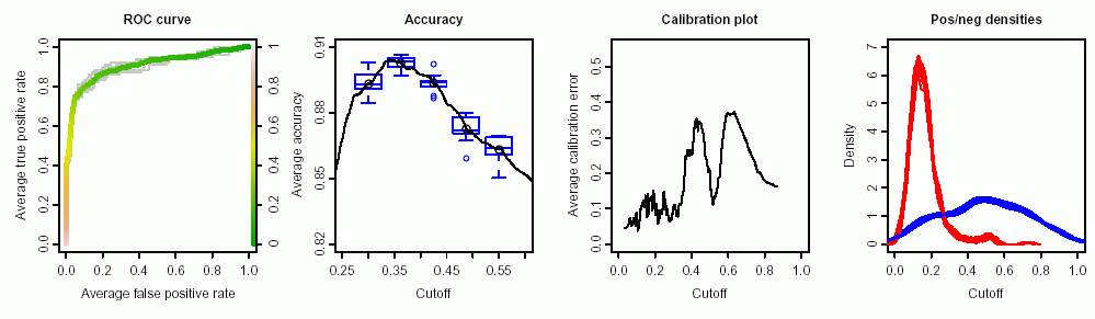
ROC graphs, sensitivity/specificity curves, lift charts, and precision/recall plots are popular examples of trade-off visualizations for specific pairs of performance measures. ROCR is a flexible tool for creating cutoff-parameterized 2D performance curves by freely combining two from over 25 performance measures (new performance measures can be added using a standard interface). Curves from different cross-validation or bootstrapping runs can be averaged by different methods, and standard deviations, standard errors or box plots can be used to visualize the variability across the runs. The parameterization can be visualized by printing cutoff values at the corresponding curve positions, or by coloring the curve according to cutoff. All components of a performance plot can be quickly adjusted using a flexible parameter dispatching mechanism. Despite its flexibility, ROCR is easy to use, with only three commands and reasonable default values for all optional parameters.
ROCR 

visualizing classifier performance in R, with only 3 commands
Please support our work by citing the ROCR article in your publications:
Sing T, Sander O, Beerenwinkel N, Lengauer T. [2005] ROCR: visualizing classifier performance in R. Bioinformatics 21(20):3940-1.
Free full text: http://bioinformatics.oxfordjournals.org/content/21/20/3940.full

ROCR was originally developed at the Max Planck Institute for Informatics
Introduction
ROCR (with obvious pronounciation) is an R package for evaluating and visualizing classifier performance. It is...
- ...easy to use: adds only three new commands to R.
- ...flexible: integrates tightly with R's built-in graphics facilities.
- ...powerful: Currently, 28 performance measures are implemented, which can be freely combined to form parametric curves such as ROC curves, precision/recall curves, or lift curves. Many options such as curve averaging (for cross-validation or bootstrap), augmenting the averaged curves by standard error bar or boxplots, labeling cutoffs to the curve, or coloring curves according to cutoff.
Performance measures that ROCR knows:
Accuracy, error rate, true positive rate, false positive rate, true negative rate, false negative rate, sensitivity, specificity, recall, positive predictive value, negative predictive value, precision, fallout, miss, phi correlation coefficient, Matthews correlation coefficient, mutual information, chi square statistic, odds ratio, lift value, precision/recall F measure, ROC convex hull, area under the ROC curve, precision/recall break-even point, calibration error, mean cross-entropy, root mean squared error, SAR measure, expected cost, explicit cost.
ROCR features:
ROC curves, precision/recall plots, lift charts, cost curves, custom curves by freely selecting one performance measure for the x axis and one for the y axis, handling of data from cross-validation or bootstrapping, curve averaging (vertically, horizontally, or by threshold), standard error bars, box plots, curves that are color-coded by cutoff, printing threshold values on the curve, tight integration with Rs plotting facilities (making it easy to adjust plots or to combine multiple plots), fully customizable, easy to use (only 3 commands).
Installation of ROCR
The most straightforward way to install and use ROCR is to install it from
CRAN by starting R and using the install.packages function:
install.packages("ROCR")
Alternatively you can install it from command line using the tar ball like this:
R CMD INSTALL ROCR_*.tar.gz
Getting started
from within R ...
library(ROCR)
demo(ROCR)
help(package=ROCR)
Examples
Using ROCR's 3 commands to produce a simple ROC plot:
pred <- prediction(predictions, labels)
perf <- performance(pred, measure = "tpr", x.measure = "fpr")
plot(perf, col=rainbow(10))
Documentation
- The Reference Manual found here
- Slide deck for a tutorial talk (feel free to re-use for teaching, but please give appropriate credits and write us an email) [PPT]
- A few pointers to the literature on classifier evaluation
Contact
Questions, comments, and suggestions are very welcome. Open an issue on GitHub and we can discuss. We are also interested in seeing how ROCR is used in publications. Thus, if you have prepared a paper using ROCR we'd be happy to know.