prefviz
Visualizes Preferential Data in One and More Contests
A visualization toolkit for preferential data, such as ranked-choice election results, tournament outcomes,
and survey responses. The package provides methods to visualise the preference distribution of one contest with
bar charts and pairwise comparisons of two contestants, as well as methods to visualise multiple contests through
2D and high-dimensional simplex plots both statically and interactively. HD simplex displays are implemented via projection
methods using the 'tourr' and 'detourr' packages, enabling dynamic exploration of high-dimensional preference structure.
For more details on HD simplex projection, see Wickham et al. (2011)
prefviz 
prefviz is a visualisation toolkit for preferential data, where
individuals rank or order a set of alternatives, such as ranked-choice
election ballots, tournament results, or survey rankings. The package
makes it easy to explore both single-contest and multi-contest
preference patterns through three complementary plot types:
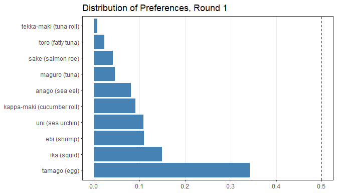
- Distribution of preferences bar chart shows the marginal vote shares for each candidate in a single contest.
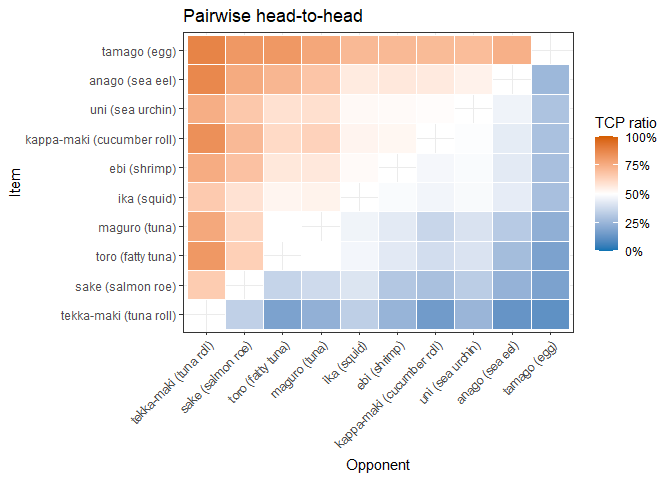
- Pairwise heatmap reveals head-to-head competition between every pair of candidates, including Condorcet winner/loser detection.
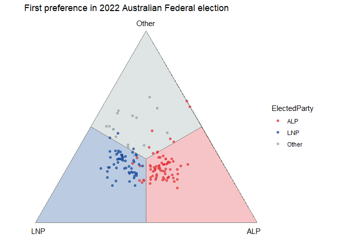
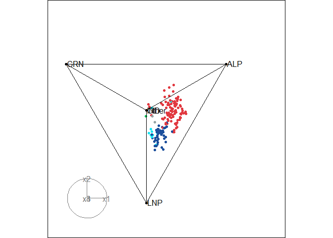
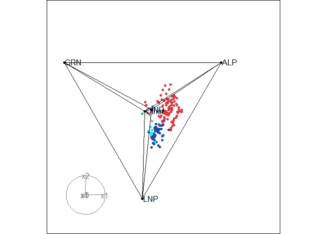
- Ternary plot compares multiple sets of preferences simultaneously
by placing each one as a point inside a simplex, where each vertex
represents one items and a point’s position reflects how support is
split among all items. Traditional ternary plots support three items
via a 2D simplex - an equilateral triangle, but
prefvizextends this to high dimensions via animated tours when there are more than 3 items.
Installation
prefviz is available on CRAN:
install.packages("prefviz")
The development version of prefviz can be installed via:
# install.packages("devtools")
remotes::install_github("numbats/prefviz")
Getting started
Distribution of preferences bar chart
Used when you want to understand how preferences is spread across items in a single contest.
sushi_data <- prefio::read_preflib(
  "00014 - sushi/00014-00000001.soc",
  from_preflib = TRUE
)

irv_result <- dop_irv(sushi_data,
                      preferences_col = preferences,
                      frequency_col   = frequency)

dop_bar(irv_result, items = -c(round, winner), at_round = 1)
Pairwise heatmap
Used when you want to examine head-to-head competition between every pair of candidates and identify Condorcet winners or losers.
pw <- pairwise_calculator(sushi_data,
                          preferences_col = preferences,
                          frequency_col   = frequency)
pw
#> Pairwise analysis (10 items)
#>
#> Head-to-head results (first 5 rows):
#>        item_a            item_b wins_a wins_b total tcp_a tcp_b
#>  ebi (shrimp)   anago (sea eel)   2152   2848  5000 43.0% 57.0%
#>  ebi (shrimp)     maguro (tuna)   2848   2152  5000 57.0% 43.0%
#>  ebi (shrimp)       ika (squid)   2570   2430  5000 51.4% 48.6%
#>  ebi (shrimp)  uni (sea urchin)   2428   2572  5000 48.6% 51.4%
#>  ebi (shrimp) sake (salmon roe)   3449   1551  5000 69.0% 31.0%
#>        h2h_winner
#>   anago (sea eel)
#>      ebi (shrimp)
#>      ebi (shrimp)
#>  uni (sea urchin)
#>      ebi (shrimp)
#>
#> Condorcet winner: tamago (egg)
#> Condorcet loser:  tekka-maki (tuna roll)

pairwise_heatmap(pw, value = "tcp")
Ternary plot
Used when you want to compare preference distributions across many sets of preferences simultaneously. Each point is one set of preference (e.g. an electoral division, a customer survey, etc.), and its position inside the simplex reflects how support is split among the items.
# First-preference shares across 2025 Australian Federal Election divisions
tern22_df <- aecdop22_transformed |>
  filter(CountNumber == 0)
head(tern22_df)
#> # A tibble: 6 × 6
#>   DivisionNm CountNumber ElectedParty   ALP   LNP Other
#>   <chr>            <dbl> <chr>        <dbl> <dbl> <dbl>
#> 1 Adelaide             0 ALP          0.400 0.32  0.280
#> 2 Aston                0 LNP          0.325 0.430 0.244
#> 3 Ballarat             0 ALP          0.447 0.271 0.282
#> 4 Banks                0 LNP          0.353 0.452 0.195
#> 5 Barker               0 LNP          0.209 0.556 0.235
#> 6 Barton               0 ALP          0.504 0.262 0.234

# Create ternable object
tern22 <- as_ternable(tern22_df, ALP:Other)

# Plot
ggplot(get_tern_data2d(tern22), aes(x = x1, y = x2)) +
  add_ternary_base() +
  geom_ternary_region(
    vertex_labels = tern22$vertex_labels,
    aes(fill = after_stat(vertex_labels)),
    alpha = 0.3, color = "grey50", show.legend = FALSE
  ) +
  geom_point(aes(color = ElectedParty), alpha = 0.7) +
  add_vertex_labels(tern22$simplex_vertices) +
  scale_fill_manual(
    values = c("ALP" = "#E13940", "LNP" = "#1C4F9C","Other" = "#95A5A6"),
    aesthetics = c("fill", "colour")
  ) +
  labs(title = "First preference in 2022 Australian Federal election")
When there are more than 3 alternatives, use get_tern_datahd() and
get_tern_edges() to prepare the data for an animated tour through the
high-dimensional simplex via the tourr package.
# Load the data
aecdop25_transformed <- prefviz::aecdop25_transformed |>
  filter(CountNumber == 0)
head(aecdop25_transformed)
#> # A tibble: 6 × 8
#>   DivisionNm CountNumber ElectedParty   ALP    GRN   LNP Other    IND
#>   <chr>            <dbl> <chr>        <dbl>  <dbl> <dbl> <dbl>  <dbl>
#> 1 Adelaide             0 ALP          0.465 0.190  0.242 0.104 0
#> 2 Aston                0 ALP          0.373 0      0.377 0.209 0.0414
#> 3 Ballarat             0 ALP          0.424 0      0.286 0.262 0.0281
#> 4 Banks                0 ALP          0.364 0.119  0.391 0.106 0.0202
#> 5 Barker               0 LNP          0.225 0.0816 0.5   0.135 0.0586
#> 6 Barton               0 ALP          0.471 0.159  0.242 0.128 0

# Create ternable object
tern25 <- as_ternable(aecdop25_transformed, ALP:IND)

# Plot
party_colors <- c(
  "ALP" = "#E13940", # Red
  "LNP" = "#1C4F9C", # Blue
  "GRN" = "#10C25B", # Green
  "IND" = "#1ce5f3", # Teal
  "Other" = "#95A5A6" # Grey
)

tourr_data <- get_tern_datahd(tern25)
color_vector <- c(
  rep("black", 5),
  party_colors[aecdop25_transformed |> filter(CountNumber == 0) |> pull(ElectedParty)]
)

tourr::animate_xy(
  dplyr::select(tourr_data, starts_with("x")),
  edges      = get_tern_edges(tern25),
  obs_labels = tourr_data[["labels"]],
  col        = color_vector,
  axes       = "bottomleft"
)
Learn more
To learn more about the visualisations, especially ternary plots, see the package vignettes:
vignette("transform_raw_data", package = "prefviz")- introduction to common preferential data formats and how to usedop_transform()anddop_irv()to transform raw data to be ready for visualisationvignette("draw_ternary_plot", package = "prefviz")- step-by-step guide to building 2D and high-dimensional ternary plots withas_ternable(),get_tern_*(), andtourr.vignette("add_ordered_path", package = "prefviz")- how to add ordered paths to your ternary plots to trace how preference distributions evolve over time or across preference sets
References
Cook D., Laa, U. (2024) Interactively exploring high-dimensional data and models in R, https://dicook.github.io/mulgar_book/, accessed on 2025/12/20.