gghdx
HDX Theme, Scales, and Other Conveniences for 'ggplot2'
A Humanitarian Data Exchange (HDX) theme, color palettes, and scales for 'ggplot2' to allow users to easily follow the HDX visual design guide, including convenience functions for for loading and using the Roboto and Merriweather fonts.
gghdx 


Overview
The goal of gghdx is to make it as simple as possible to follow the HDX visual guidelines when creating graphs using ggplot2. While most of the functionality is in allowing easy application of the HDX color ramps, the package also streamlines some of the other recommendations and best practices regarding plotted text, axis gridlines, and other visual features. The key functionalities are:
theme_hdx()is the general package theme.scale_color_hdx_...()andscale_fill_hdx_...()applies the HDX color scale to the relevant aesthetics.hdx_colors(),hdx_hex(), andhdx_pal_...()provide easy user access to the HDX color template. You can view the colorsgeom_text_hdx()andgeom_label_hdx()wrap the respective base functions to plot text using HDX fonts and aesthetics.scale_y_continuous_hdx()wrapsscale_y_continuous()to plot data directly starting from the y-axis.gghdx()ensures plot for the session use HDX defaults for color and fill scales, usestheme_hdx()for all plots, and appliesscale_color_hdx_...()andscale_fill_hdx_...()label_number_hdx()andformat_number_hdx()supplement thescales::label_...()series of functions to format and create labels for numbers in the HDX style.
Installation
You can install gghdx directly from CRAN:
install.packages("gghdx")
You can install the development version from GitHub:
## install.packages("remotes")
remotes::install_github("OCHA-DAP/gghdx")
Using the package
The package is designed so the user just has to run gghdx() once a
session and mainly forget about it. This will automatically set your
ggplot2 to use the HDX theme, palettes, fonts, and more by default. If
you want more control or want to better understand how the package
works, please see the details below!
Theme
A quick and simple example would be plotting the iris dataset included
in base R.
library(ggplot2)

p <- ggplot(
  iris,
  aes(
    x = Sepal.Length,
    y = Petal.Length,
    color = Species
  )
) +
  geom_point() +
  labs(
    title = "Iris species distributed by sepal and petal lengths",
    y = "Petal length",
    x = "Sepal length"
  )

p
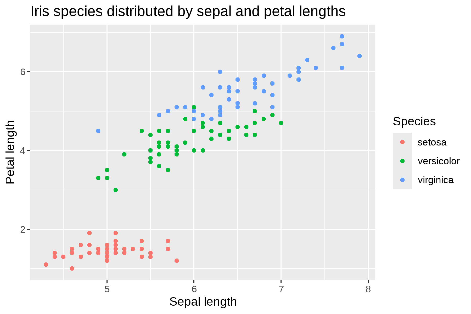
This output using the base ggplot style doesn’t look particularly bad,
but we can use theme_hdx() to quickly adjust some of the styling to
fit the style guide.
library(gghdx)

p + theme_hdx(base_family = "sans", title_family = "sans")
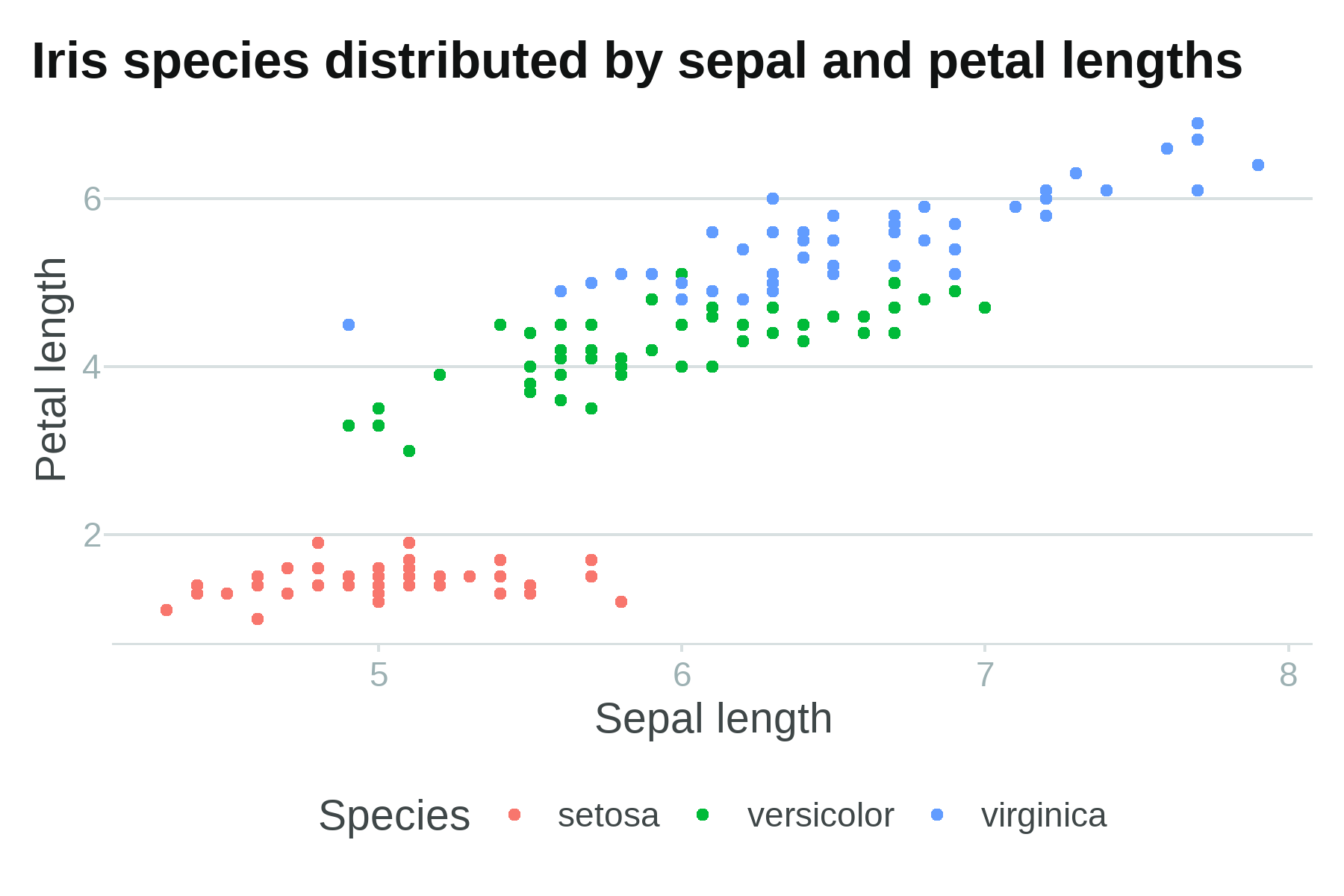
Now, axis lines have been cleaned up and the plot better resembles recommendations from the visual guide with just that single line of code.
Color palettes
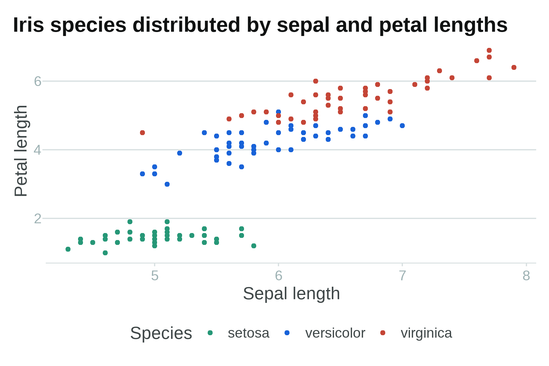
However, the color palette for the points is still using the base R
palette. We can use one of the many scale_...hdx() functions to use
HDX colors. Let’s just use the primary discrete color scale that will
align each species with one of the 3 non-neutral colorramps from the
2025 HDX redesign (primary blue, brand teal, and error red).
p +
  theme_hdx(base_family = "sans", title_family = "sans") +
  scale_color_hdx_discrete()
You can check the documentation of any of the scale_...hdx() functions
to see all available scales, or directly access the colors using
hdx_colors() or the raw list in hdx_color_list. The available
palettes can be easily visualized using hdx_display_pal(). The
original sapphire, mint, and tomato colorramps are still available
(e.g. scale_color_hdx_sapphire()) for backwards compatibility.
Adding fonts
We also would like to use the HDX font families. As of the 2025 redesign, HDX uses Merriweather for titles and other display text, and Roboto for body text. Since both are free Google fonts, they’re relatively easy to access in R. gghdx uses the sysfonts package to load the Google fonts and then showtext to include them in our plot. You can also use the extrafont package as an alternative if you have the fonts installed locally. This requires ghostscript to be installed locally and can run into other issues, such as font names not being found.
Below, I use the showtext package because it’s simpler.
load_hdx_fonts() wraps exactly this for both fonts at once.
library(showtext)
#> Loading required package: sysfonts
#> Loading required package: showtextdb

font_add_google("Merriweather")
font_add_google("Roboto")
showtext_auto()

p +
  theme_hdx(base_family = "Roboto", title_family = "Merriweather") +
  scale_color_hdx_discrete()
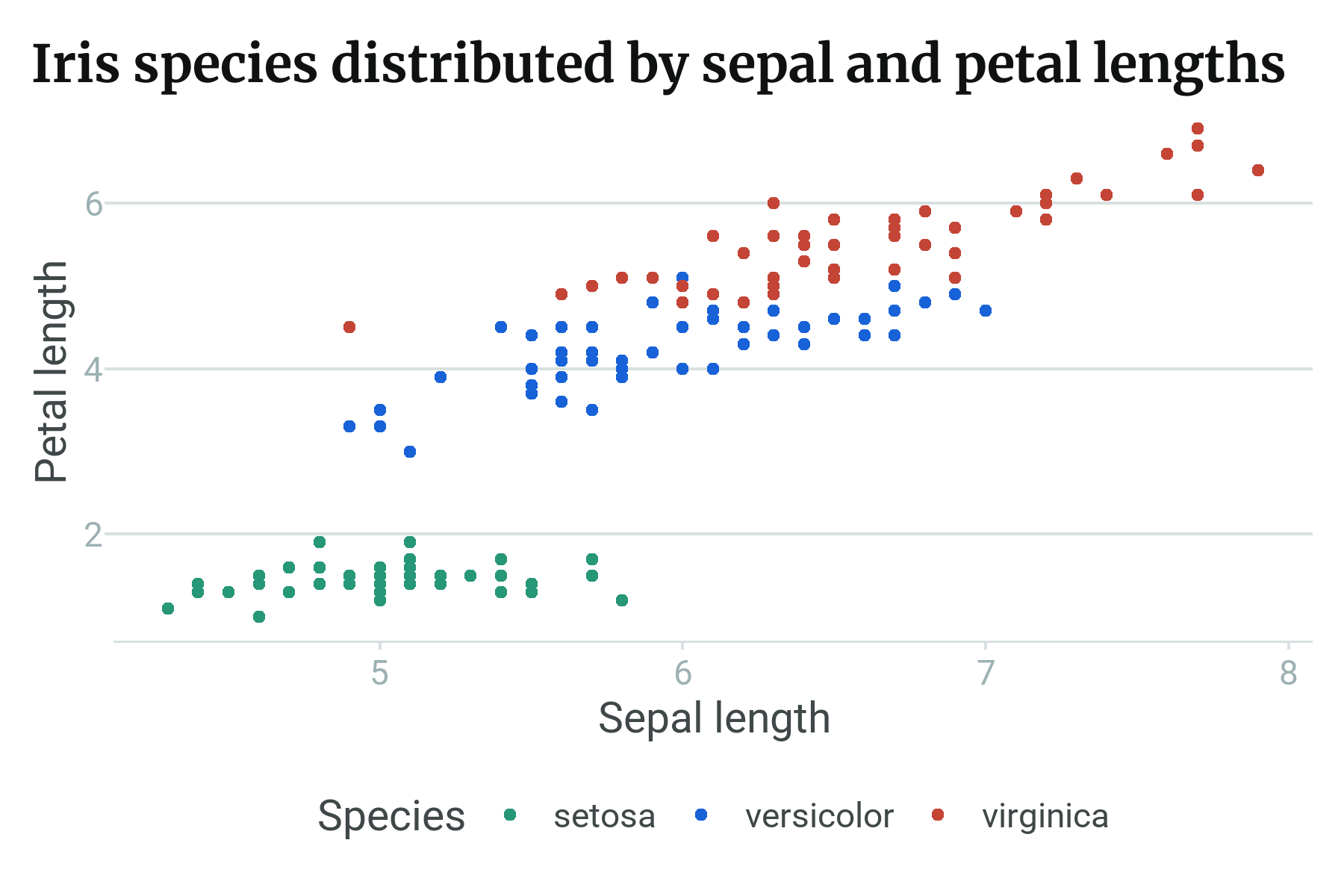
Streamlined plotting
As clear above, even though we have an HDX theme function, we still have
to separately call the scale function to adjust our colors. And we have
to call these every time we make a new plot. So, to make life simpler,
gghdx() is provided as a convenience function that sets ggplot to:
- automatically use the HDX theme by default;
- use default HDX primary blue for point and line colors, and HDX data-grid blue for fill when not an aesthetic;
- use
scale_fill_hdx_discrete()andscale_color_hdx_discrete()as the default discrete fill and color respectively; - use
scale_fill_gradient_hdx_primary()andscale_color_gradient_hdx_primary()as the default continuous fill and color; - loads the Roboto and Merriweather fonts from Google and activates their usage for the current session.
You just have to run gghdx() once a session, and then our plots will
already be where we would like!
gghdx()
p
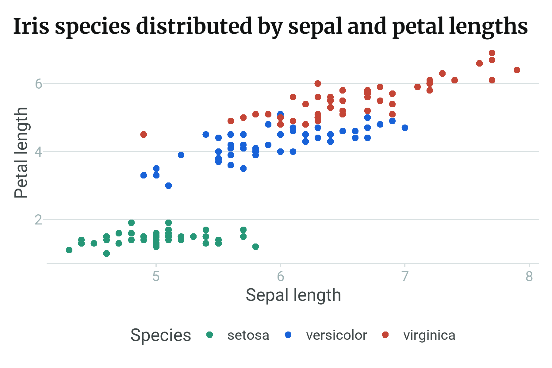
And voíla, we have our graph without specifying the theme or color scale.
COVID plots
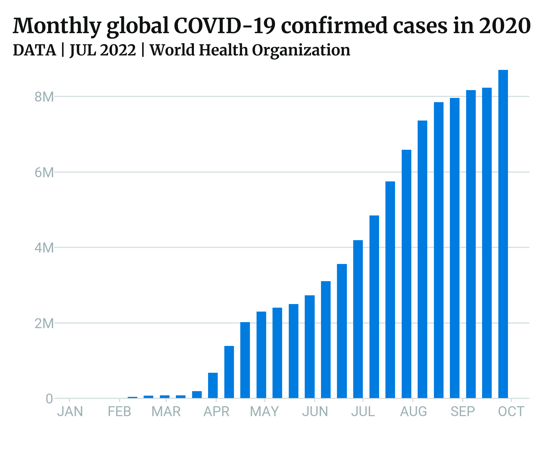
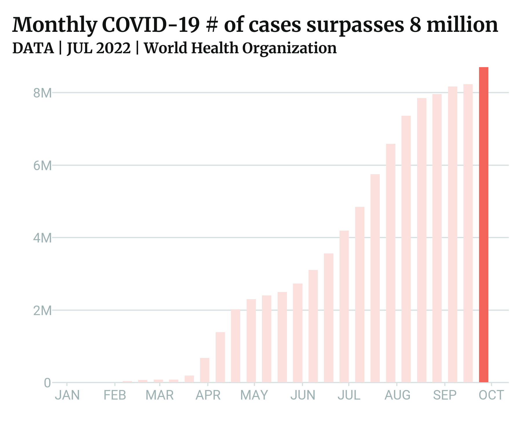
As a final example, we can closely match the COVID plots referenced in
the original visual guide using the theme and color scales in the
package. These reference plots predate the 2025 redesign, so this
example intentionally uses the legacy sapphire/tomato colorramps
(kept for backwards compatibility) rather than the new primary/error
scales, to match the published images.
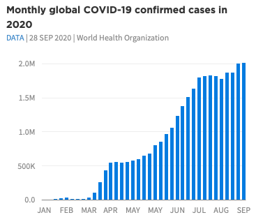
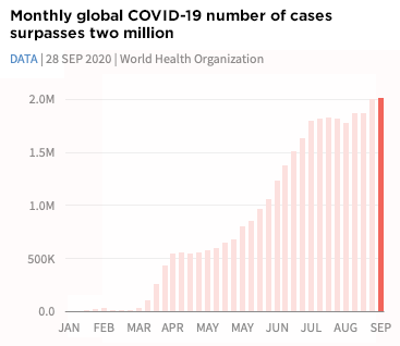
The inbuilt data gghdx::df_covid has aggregated COVID data we can use
to mirror this plot. To make the data start at the y-axis, we can use
scale_y_continuous_hdx() which sets expand = c(0, 0) by default, and
the label_number_hdx() function to create custom labels.
p_blue <- ggplot(
  df_covid,
  aes(
    x = date,
    y = cases_monthly
  )
) +
  geom_bar(
    stat = "identity",
    width = 6,
    fill = hdx_hex("sapphire-hdx") # use sapphire for fill
  ) +
  scale_y_continuous_hdx(
    labels = label_number_hdx()
  ) +
  scale_x_date(
    date_breaks = "1 month",
    labels = function(x) toupper(strftime(x, "%b"))
  ) +
  labs(
    title = "Monthly global COVID-19 confirmed cases in 2020",
    subtitle = "DATA | JUL 2022 | World Health Organization",
    x = "",
    y = ""
  )

p_blue

# create red plot
p_blue +
  geom_bar(
    aes(
      fill = flag
    ),
    width = 6,
    stat = "identity"
  ) +
  scale_fill_hdx_tomato() +
  theme(
    legend.position = "none"
  ) +
  labs(
    title = "Monthly COVID-19 # of cases surpasses 8 million"
  )
We’ve used relatively few lines of code to match fairly closely these examples plots!