raptools
Risk Assessment Plot and Reclassification Metrics
Assessing the comparative performance of two logistic regression models or results of such models or classification models. Discrimination metrics include Integrated Discrimination Improvement (IDI), Net Reclassification Improvement (NRI), and difference in Area Under the Curves (AUCs), Brier scores and Brier skill. Plots include Risk Assessment Plots, Decision curves and Calibration plots. Methods are described in Pickering and Endre (2012)
raptools 
John W Pickering
27 June 2023
The raptools package contains functions for generating statistical metrics and visual means to assess the improvement in risk prediction of one risk model over another. It includes the Risk Assessment Plot (hence rap).
Installation
You can install raptools from CRAN:
install.packages("raptools")
Or install the development version from GitHub with:
# install.packages("devtools")
devtools::install_github("Researchverse/raptools")
History and versions
raptools began as Matlab code in 2012 after I wrote a paper (1{target="_blank"}) for the Nephrology community on assessing the added value of one biomarker to a clinical prediction model. I worked with Professor Zoltan Endre on that paper. Dr David Cairns kindly provided some R code for the Risk Assessment Plot. This formed the basis of versions 0.1 to 0.4. Importantly, for those versions and the current version all errors are mine (sorry) and not those of Professor Endre or Dr Cairns. Since writing that paper I've come to consider some metrics as not helpful. So, for the current version I have dropped some statistical metrics that I believe are poor or wrongly applied. In particularly, I dropped providing the total NRI (Net Reclassification Improvement) and total IDI (Integrated Discrimination Improvement) metrics. These should never be presented because they inappropriately add together two fractions with differing denominators (NRI) or two means (IDI). Instead, these the NRIs and IDIs for those with and without the event of interest should be provided. Third, I have provided the change in AUCs rather than a p-value because the change is much more meaningful.
Version 1.03 were major changes:
- allowed as input logistic regression models from glm (stats) and lrm (rms) as well as risk predictions calculated elsewhere.
- provided as outputs in addition to the Risk Assessment Plot, a form of calibration plot and decision curve.
- the output from the main functions CI.raplot, and CI.classNRI are now lists that include the metrics for each bootstrap sample as well as the summary metrics. CI.classNRI also produces confusion matrices for those with and without the event of interest (separately). Bootstrapping is used to determine confidence intervals.
Version 1.10 :
- addition of ROC plot.
- calibration plot now uses (best practice) continuous curves (the old format is now "ggcalibrate_original()").
- addition of precision recall curves.
- all plots can be for one or two models.
Version 1.11:
- made NRI metrics for models optional (use NRI_return = TRUE) to get them.
- changed behaviour to that "x2 = NULL" is possible for CI.raplot. It has the effect of creating a model where every probability is 0.5.
- bug fix.
Version 1.22:
- addition of ggcontribute graph.
- changed from geom_line to the geom_step for the ROC plot (because it represents the data better).
- bug fix.
Version 1.23:
- fixed
ggcalibrate_original()default parameter error whencut_typenot specified. - fixed
ggcalibrate()axis labels (changed from "percentage" to "probability" to match 0-1 scale). - fixed critical bug in lrm() model handling that caused errors when using Frank Harrell's rms::lrm() models.
- implemented missing
ci_levelparameter inggcalibrate(). - added flexible smoothing controls (
show_smooth,smooth_method,smooth_span,smooth_se) to plotting functions. - all changes maintain backward compatibility with sensible defaults.
Version 1.24 (current):
ggcalibrate()now shows the confidence interval of the calibration curve itself, rather than a smoothed band.ggcalibrate()can show the actual events (actuals = TRUE) and the confidence interval shading can be set (alpha_level).- addition of
ggcalibrate_BA(), a Bland-Altman style calibration plot.
Example 1
This is a basic example for assessing the difference between two logistic regression models:
library(dplyr)
library(raptools)

## basic example code

#### First make sure that data used has no missing values
df <- data_risk %>%
  dplyr::filter(!is.na(baseline))%>%
  dplyr::filter(!is.na(new))%>%
  dplyr::filter(!is.na(outcome))

baseline_risk <- df$baseline    # or the baseline glm model itself
new_risk <- df$new              # or the new glm model itself
outcome <- df$outcome

assessment <- CI.raplot(x1 = baseline_risk, x2 = new_risk, y = outcome,
                        n.boot = 20, dp = 2) # Note the default is 1000 bootstraps (n.boot = 1000).  This can take quite some time to run, so when testing I use a smaller number of bootstraps.

# View results
## meta data
(assessment$meta_data)
#>   Thresholds Confidence.interval Number.of.bootstraps Input.data.type
#> 1   baseline                  95                   20   User supplied
#>   X..decimal.places
#> 1                 2

## exact point estimates
(assessment$Metrics)
#> $n
#> [1] 433
#>
#> $n_event
#> [1] 86
#>
#> $n_non_event
#> [1] 347
#>
#> $Prevalence
#> [1] 0.1986143
#>
#> $IDI_event
#> [1] 0.1363479
#>
#> $IDI_nonevent
#> [1] 0.03397117
#>
#> $IP_baseline
#> [1] 0.1849132
#>
#> $IS_baseline
#> [1] 0.2516693
#>
#> $IP_new
#> [1] 0.1504058
#>
#> $IS_new
#> [1] 0.388494
#>
#> $Brier_baseline
#> [1] 0.1500246
#>
#> $Brier_new
#> [1] 0.123228
#>
#> $Brier_skill
#> [1] 17.86145
#>
#> $AUC_baseline
#> [1] 0.6823772
#>
#> $AUC_new
#> [1] 0.8227331
#>
#> $AUC_difference
#> [1] 0.1403559

## bootstrap derived metrics with confidence intervals
(assessment$Summary_metrics)
#> # A tibble: 16 x 2
#>    metric         statistics
#>    <chr>          <chr>
#>  1 n              433 (CI: 433 to 433)
#>  2 n_event        86 (CI: 67.75 to 96.57)
#>  3 n_non_event    347 (CI: 336.42 to 365.25)
#>  4 Prevalence     0.2 (CI: 0.16 to 0.22)
#>  5 IDI_event      0.14 (CI: 0.1 to 0.17)
#>  6 IDI_nonevent   0.03 (CI: 0.02 to 0.05)
#>  7 IP_baseline    0.18 (CI: 0.18 to 0.19)
#>  8 IS_baseline    0.26 (CI: 0.23 to 0.28)
#>  9 IP_new         0.15 (CI: 0.14 to 0.16)
#> 10 IS_new         0.39 (CI: 0.35 to 0.42)
#> 11 Brier_baseline 0.15 (CI: 0.12 to 0.16)
#> 12 Brier_new      0.12 (CI: 0.1 to 0.14)
#> 13 Brier_skill    16.91 (CI: 9.62 to 23.86)
#> 14 AUC_baseline   0.7 (CI: 0.65 to 0.75)
#> 15 AUC_new        0.82 (CI: 0.78 to 0.86)
#> 16 AUC_difference 0.14 (CI: 0.08 to 0.17)
Graphical assessments
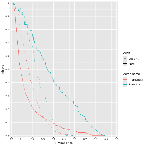
The Risk Assessment Plot
ggrap(x1 = baseline_risk, x2 = new_risk, y = outcome)
plot of chunk ggrap
# for Single risks x2 = NULL
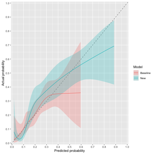
The calibration curve
ggcalibrate(x1 = baseline_risk, x2 = new_risk, y = outcome)
plot of chunk ggcalibrate
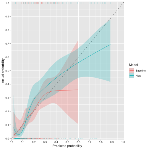
The shaded areas are the 95% confidence intervals of each curve. To also show the actual events (0 or 1) against the predictions:
ggcalibrate(x1 = baseline_risk, x2 = new_risk, y = outcome, actuals = TRUE)
plot of chunk ggcalibrate_actuals
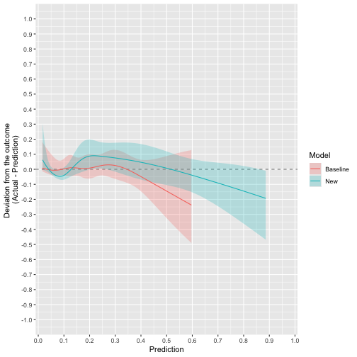
The Bland-Altman style calibration curve
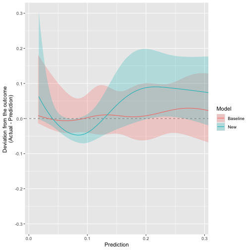
The same calibration curves, plotted as the deviation from the outcome (Actual - Prediction). Perfect calibration is the horizontal line at zero; above it the model under-predicts and below it the model over-predicts.
ggcalibrate_BA(x1 = baseline_risk, x2 = new_risk, y = outcome)
plot of chunk ggcalibrate_BA
Zoom in on the predictions that matter, eg below 30%:
ggcalibrate_BA(x1 = baseline_risk, x2 = new_risk, y = outcome) +
  ggplot2::coord_cartesian(xlim = c(0, 0.3), ylim = c(-0.3, 0.3))
plot of chunk ggcalibrate_BA_zoom
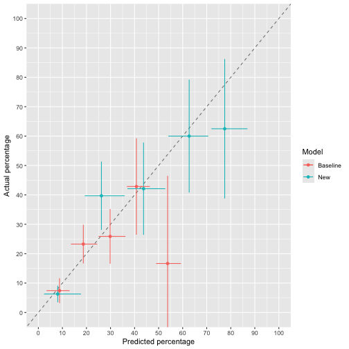
The original calibration curve
ggcalibrate_original(x1 = baseline_risk, x2 = new_risk, y = outcome,  cut_type = "interval")
#> $g
plot of chunk ggcalibrate_original
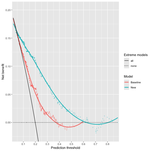
The decision curve
ggdecision(x1 = baseline_risk, x2 = new_risk, y = outcome)
plot of chunk ggdecision
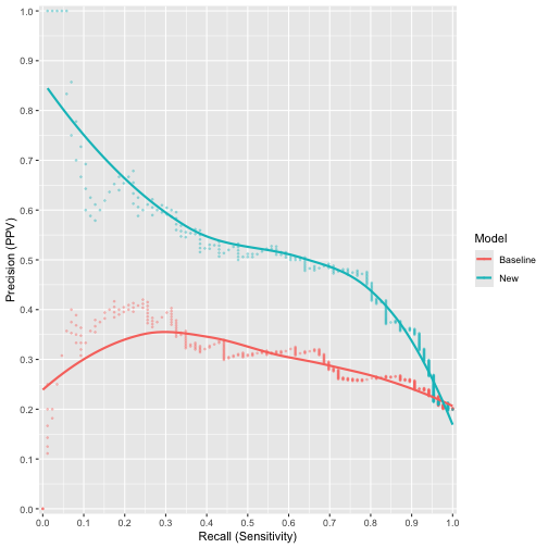
The precision-recall curve
ggprerec(x1 = baseline_risk, x2 = new_risk, y = outcome)
plot of chunk ggrerec
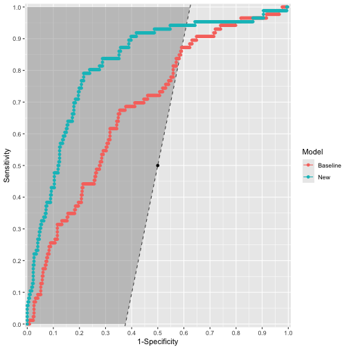
The roc plot
ggroc(x1 = baseline_risk, x2 = new_risk, y = outcome, carrington_line = TRUE)
plot of chunk ggroc
Note, there are additional options for the ROC plot including labelling points and distinguishing areas of the plot that are diagnostic from those that are not.
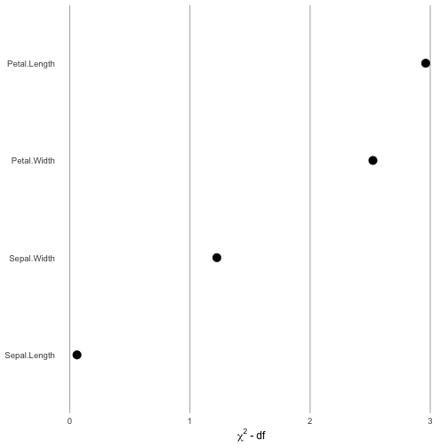
The contribution plot
Thanks to Professor Frank Harrell for these plots.
load("inst/extdata/fit_example")
ggcontribute(x1 = eg_fit.glm)
plot of chunk ggcontribute
Example 2
This is a basic example for assessing the difference in the results of reclassification:
## basic example code

baseline_class <- data_class$base_class
new_class <- data_class$new_class
outcome_class <- data_class$outcome

class_assessment <- CI.classNRI(c1 = baseline_class, c2 = new_class, y = outcome_class,
                                n.boot = 20, dp = 2) # Note the default is 2000 bootstraps (n.boot = 2000).  This can take quite some time to run, so when testing I use a smaller number of bootstraps.

# View results
## meta data
(class_assessment$meta_data)
#>   Confidence.interval Number.of.bootstraps X..decimal.places
#> 1                  95                   20                 2

## exact point estimates and confusion matrices
(class_assessment$Metrics)
#> $n
#> [1] 444
#>
#> $n_event
#> [1] 62
#>
#> $n_non_event
#> [1] 382
#>
#> $Prevalence
#> [1] 0.1396396
#>
#> $NRI_up_event
#> [1] 21
#>
#> $NRI_up_nonevent
#> [1] 94
#>
#> $NRI_down_event
#> [1] 5
#>
#> $NRI_down_nonevent
#> [1] 71
#>
#> $NRI_event
#> [1] 0.2580645
#>
#> $NRI_nonevent
#> [1] -0.06020942
#>
#> $wNRI_event
#> NULL
#>
#> $wNRI_nonevent
#> NULL
#>
#> $confusion.matrix_event
#>          New
#> Baseline  class_1 class_2 class_3 class_4 class_5 class_6
#>   class_1       0       0       0       0       0       0
#>   class_2       0       2       3       0       0       0
#>   class_3       0       1       0       2       0       0
#>   class_4       0       0       2       9      11       1
#>   class_5       0       0       0       2      25       4
#>   class_6       0       0       0       0       0       0
#>
#> $confusion.matrix_nonevent
#>          New
#> Baseline  class_1 class_2 class_3 class_4 class_5 class_6
#>   class_1       0       0       0       0       0       0
#>   class_2       9      52      17       3       1       0
#>   class_3       2      29      66      44       3       0
#>   class_4       0       2      21      52      25       0
#>   class_5       0       0       0       8      47       1
#>   class_6       0       0       0       0       0       0

## bootstrap derived metrics with confidence intervals
(class_assessment$Summary_metrics)
#> # A tibble: 10 x 2
#>    metric            statistics
#>    <chr>             <chr>
#>  1 n                 444 (CI: 444 to 444)
#>  2 n_event           60 (CI: 52.95 to 71.1)
#>  3 n_non_event       384 (CI: 372.9 to 391.05)
#>  4 Prevalence        0.14 (CI: 0.12 to 0.16)
#>  5 NRI_up_event      21.5 (CI: 15.48 to 27.05)
#>  6 NRI_up_nonevent   93.5 (CI: 81 to 103.53)
#>  7 NRI_down_event    5 (CI: 1.48 to 8)
#>  8 NRI_down_nonevent 74.5 (CI: 58.9 to 83.1)
#>  9 NRI_event         0.27 (CI: 0.16 to 0.36)
#> 10 NRI_nonevent      -0.05 (CI: -0.1 to 0)