UpAndDownPlots
Displays Percentage and Absolute Changes
Displays percentage changes by height and absolute changes by area for up to three nested or non-nested levels. The plots visualise changes in indices and markets, showing how the changes for sectors or for individual components contribute to the overall change. Data can be classified by up to three levels of grouping variables in a layered, hierarchical plot. Each level can be ordered in several ways including by baseline, by percentage change, and by absolute change. The vignettes give examples.
UpAndDownPlots
UpAndDown plots display percentage changes by height and absolute changes by area for up to three hierarchical levels. They can visualise changes in indices, showing how the changes for sectors or for individual components contribute to the overall change.
Install in the usual way
install_github(“antonr4/UpAndDownPlots”)
Example
The Northern Ireland population grew by 3.12% between 2011 and 2017. What were the changes by the four age groups reported?
library(UpAndDownPlots)
popx <- ud_prep(NIpop, v1="y2011", v2="y2017", levs=c("age"), sortLev="orig")
p1 <- ud_plot(popx, labelvar="age")
p1$uadl
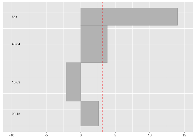
The 65+ age group increased by almost 20% and the 16-39 group actually declined. It is useful to note that the older group was less than half of the size of the 16-39 group in 2011.
There are more examples in the package vignettes.