tintin
Tintin Palette Generator
Palettes generated from Tintin covers. There is one palette per
cover, with a total of 24 palettes of 5 colours each. Includes functions to
interpolate colors in order to create more colors based on the provided
palettes.The data is based on Cyr, et al. (2004)
tintin 
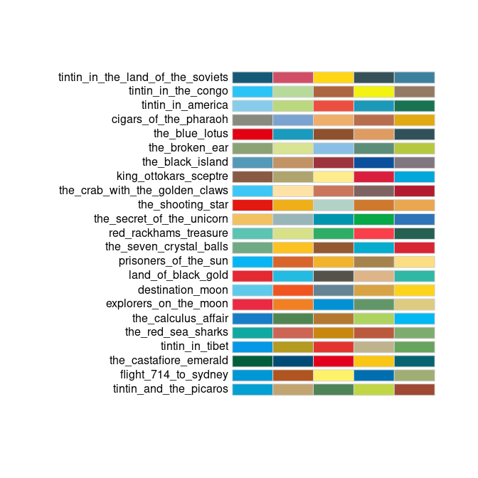
The goal of tintin is to provide palettes generated from Tintin covers. There is one palette per cover, with a total of 24 palettes of 5 colours each. Includes functions to interpolate colors in order to create more colors based on the provided palettes.
Installation
You can install the development version of tintin like so:
remotes::install_github("pachadotdev/tintin")
Example
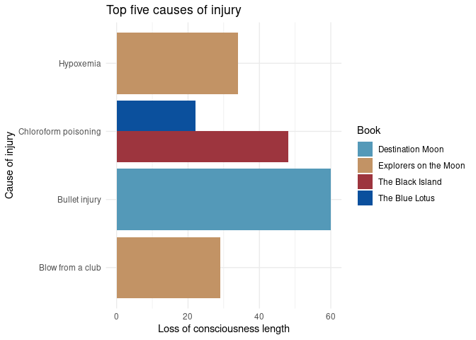
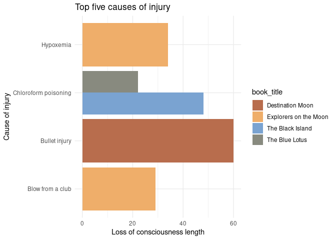
This is a basic example which shows you how to create a plot. We’ll plot
the top five causes of injury in the tintin_head_trauma dataset that
comes with the package.
library(dplyr)
library(ggplot2)
library(tintin)

total_head_trauma_5 <- tintin_head_trauma %>%
  arrange(-loss_of_consciousness_length) %>%
  filter(row_number() <= 5)

ggplot(total_head_trauma_5) +
  geom_col(aes(x = cause_of_injury, y = loss_of_consciousness_length,
    fill = book_title), position = "dodge") +
  labs(x = "Cause of injury", y = "Loss of consciousness length",
    title = "Top five causes of injury") +
  theme_minimal() +
  scale_fill_manual(values = tintin_colours$the_black_island,
    name = "Book") +
  coord_flip()
What is special about the package is being able to pass the colours as a
function to ggplot2. We’ll adapt the previous example to show that
case.
ggplot(total_head_trauma_5) +
  geom_col(aes(x = cause_of_injury, y = loss_of_consciousness_length,
    fill = book_title), position = "dodge") +
  labs(x = "Cause of injury", y = "Loss of consciousness length",
    title = "Top five causes of injury") +
  theme_minimal() +
  scale_fill_tintin_d(option = "cigars_of_the_pharaoh", direction = -1) +
  coord_flip()
# Note that I can also write the palette name as
# "cigars of the pharaoh" or even as "CiGaRS  of ThE Pharaoh"
ggplot(total_head_trauma_5) +
  geom_col(aes(x = cause_of_injury, y = loss_of_consciousness_length,
    fill = book_title), position = "dodge") +
  labs(x = "Cause of injury", y = "Loss of consciousness length",
    title = "Top five causes of injury, again") +
  theme_minimal() +
  scale_fill_tintin_d(option = "cigars of the pharaoh", direction = -1) +
  coord_flip()
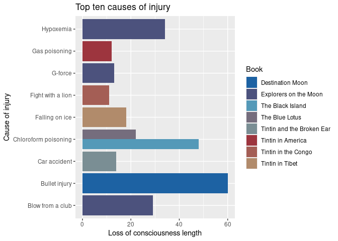
What happens if we need more colours than 5? The functions in the package can fix that. We’ll plot the top ten causes of injury.
total_head_trauma_10 <- tintin_head_trauma %>%
  arrange(-loss_of_consciousness_length) %>%
  filter(row_number() <= 10)

ggplot(total_head_trauma_10) +
  geom_col(aes(x = cause_of_injury, y = loss_of_consciousness_length,
    fill = book_title), position = "dodge") +
  labs(x = "Cause of injury", y = "Loss of consciousness length",
    title = "Top ten causes of injury") +
  scale_fill_manual(values = tintin_clrs(
    n = length(unique(total_head_trauma_10$book_title)),
    option = "the black island"),
    name = "Book") +
  coord_flip()
# or alternatively

ggplot(total_head_trauma_10) +
  geom_col(aes(x = cause_of_injury, y = loss_of_consciousness_length,
    fill = book_title), position = "dodge") +
  labs(x = "Cause of injury", y = "Loss of consciousness length",
    title = "Top ten causes of injury") +
  scale_fill_manual(values = tintin_pal(option = "the black island")(8),
    name = "Book") +
  coord_flip()
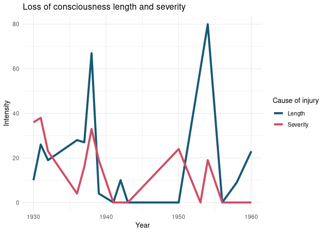
The use of colour instead of fill is analogous. Let’s plot the top ten causes of injury per year to see it.
library(tidyr)

total_head_trauma_y <- tintin_head_trauma %>%
  group_by(year) %>%
  summarise_if(is.integer, sum) %>%
  pivot_longer(loss_of_consciousness_length:loss_of_consciousness_severity) %>%
  mutate(
    name = ifelse(name == "loss_of_consciousness_length", "Length", "Severity")
  )

ggplot(total_head_trauma_y) +
  geom_line(aes(x = year, y = value, color = name), linewidth = 1.5) +
  labs(x = "Year", y = "Intensity",
    title = "Loss of consciousness length and severity") +
  theme_minimal() +
  scale_colour_manual(
    values = tintin_pal(option = "tintin in the land of the soviets")(2),
    name = "Cause of injury"
  )