shinyNextUI
'HeroUI' 'React' Template for 'shiny' Apps
A set of user interface components to create outstanding 'shiny' apps < https://shiny.posit.co/>, with the power of 'React' 'JavaScript' < https://react.dev/>. Seamlessly support dark and light themes, customize CSS with 'tailwind' < https://tailwindcss.com/>.
shinyNextUI

The goal of {shinyNextUI} is to provide a wrapper around the
HeroUI React library.
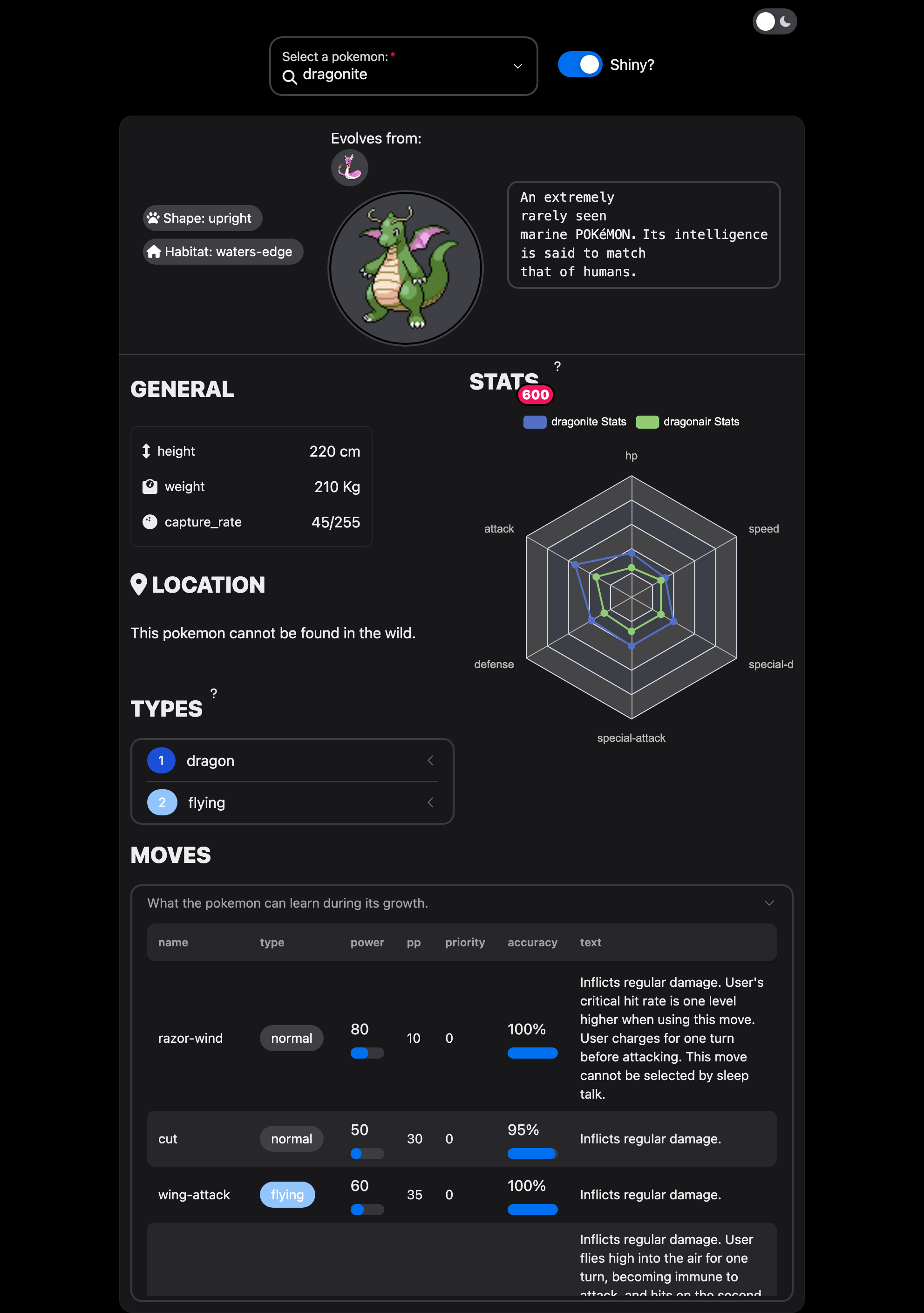
The app corresponding to the above screenshot is located here.
Notes
{shinyNextUI} is currently in alpha. Please carefully look at the current issues.
The current roadmap:
- Provide more aliases to match Shiny's vanilla notations like
selectInput, ... - Refine the navbar template.
- Allow to dynamically create themes.
{shinyNextUI} leverages tailwind css and some rules have already been pre-compiled to use in the various examples. If you need custom styles, you can use the {windy} package.
Installation
You can install the development version of {shinyNextUI} from GitHub with:
# install.packages("devtools")
devtools::install_github("RinteRface/shinyNextUI")
Example
To quickly get started with any example:
library(shinyNextUI)
# Get all examples
get_examples()
# Select an example and run the app
run_example("card")
Developer
{shinyNextUI} leverages tailwind for the CSS management and webpack as JS bundler and a mix between {shiny.react} and {reactR} for components and input management.
Within the js folder, run npm install. Then, for each change:
# Update CSS
npx tailwindcss -i ./src/input.css -o ./src/output.css --watch

# Change JS files
yarn webpack