ggvfields
Vector Field Visualizations with 'ggplot2'
A 'ggplot2' extension for visualizing vector fields in two-dimensional space. Provides flexible tools for creating vector and stream field layers, visualizing gradients and potential fields, and smoothing vector and scalar data to estimate underlying patterns.
ggvfields 



ggvfields extends ggplot2 by providing suite of tools to visualize vector and stream fields. In addition to standard vector and stream plotting, ggvfields automatically computes and visualizes smoothed vector fields, smooth gradient fields, gradient fields derived from scalar functions, and potential fields from gradients. This integrated framework simplifies the analysis and interpretation of complex vector and scalar field data.
A manuscript describing the theoretical foundations and detailed methodologies behind ggvfields is forthcoming.
Installation
ggvfields is available on CRAN and can be installed with:
install.packages("ggvfields")
Alternatively, you can install the latest development version from GitHub with:
remotes::install_github("dusty-turner/ggvfields")
Load the package in R:
library("ggvfields")
#> Loading required package: ggplot2
options(ggplot2.continuous.colour="viridis")
Core Features
geom_vector_field() and geom_vector_field2()
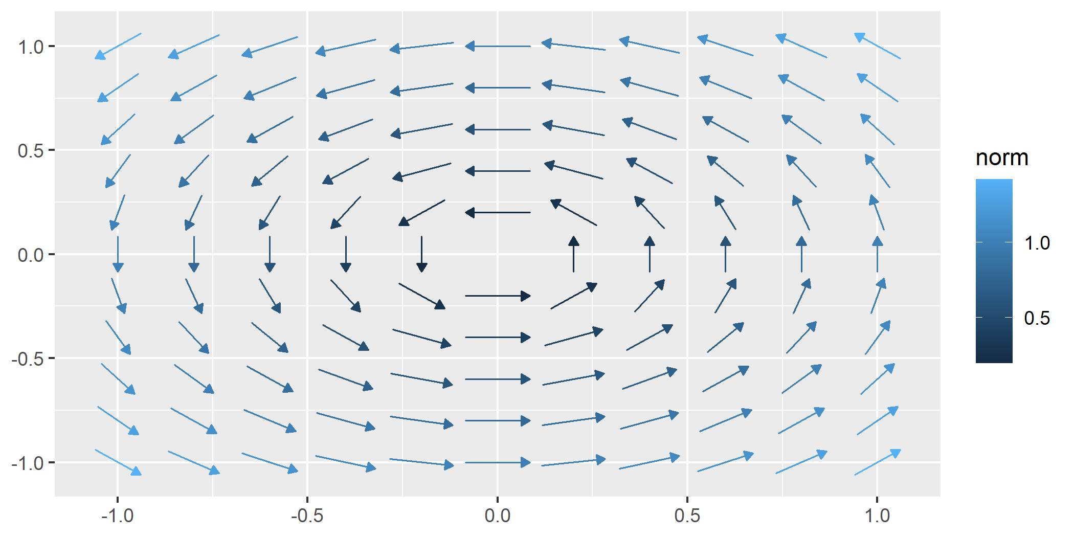
geom_vector_field(): Computes vector fields from a user-defined function over the domain ${(x,y) \in \mathbb{R}^2 : -1 < x < 1,\ -1 < y < 1}$ on an $n \times n$ grid (default: $11 \times 11$) and maps the norm to color. Vectors are centered and normalized by default.
The norm $\mathbf{w} = (u, v)$ is calculated $$|\mathbf{w}| = \sqrt{u^2 + v^2}$$ .
f <- function(v) c(-v[2], v[1]) # Define a function for the field

ggplot() +
  geom_vector_field(fun = f)
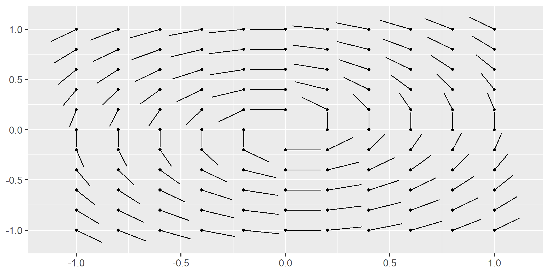
geom_vector_field2(): Similar togeom_vector_field(), but maps the norm of vectors to their lengths instead of color.
ggplot() +
  geom_vector_field2(fun = f)
Why Length Mapping Matters
Mapping vector lengths to their norms allows viewers to immediately
understand magnitude differences without relying solely on color. This
feature of geom_vector2() enhances interpretability by using actual
vector lengths to represent magnitude. The legend reflects the scaling
and ensures correct interpretation.
geom_vector_field()options
Length
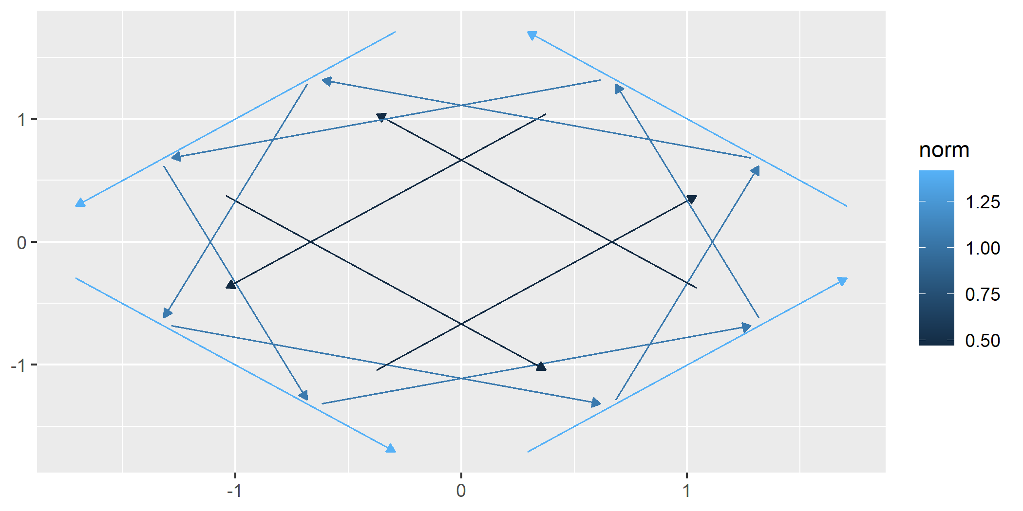
We can set the L parameter to visualize vectors at a specified length.
ggplot() +
  geom_vector_field(fun = f, n = 4, L = 2)
Center
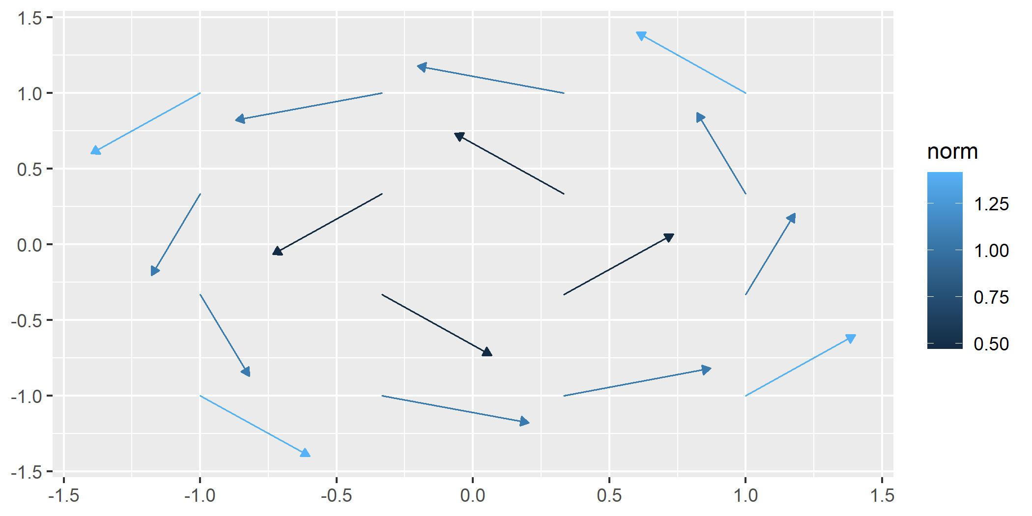
By default, all vectors are centered on their origin. We can turn off centering.
ggplot() +
  geom_vector_field(fun = f, n = 4, center = FALSE)
normalize
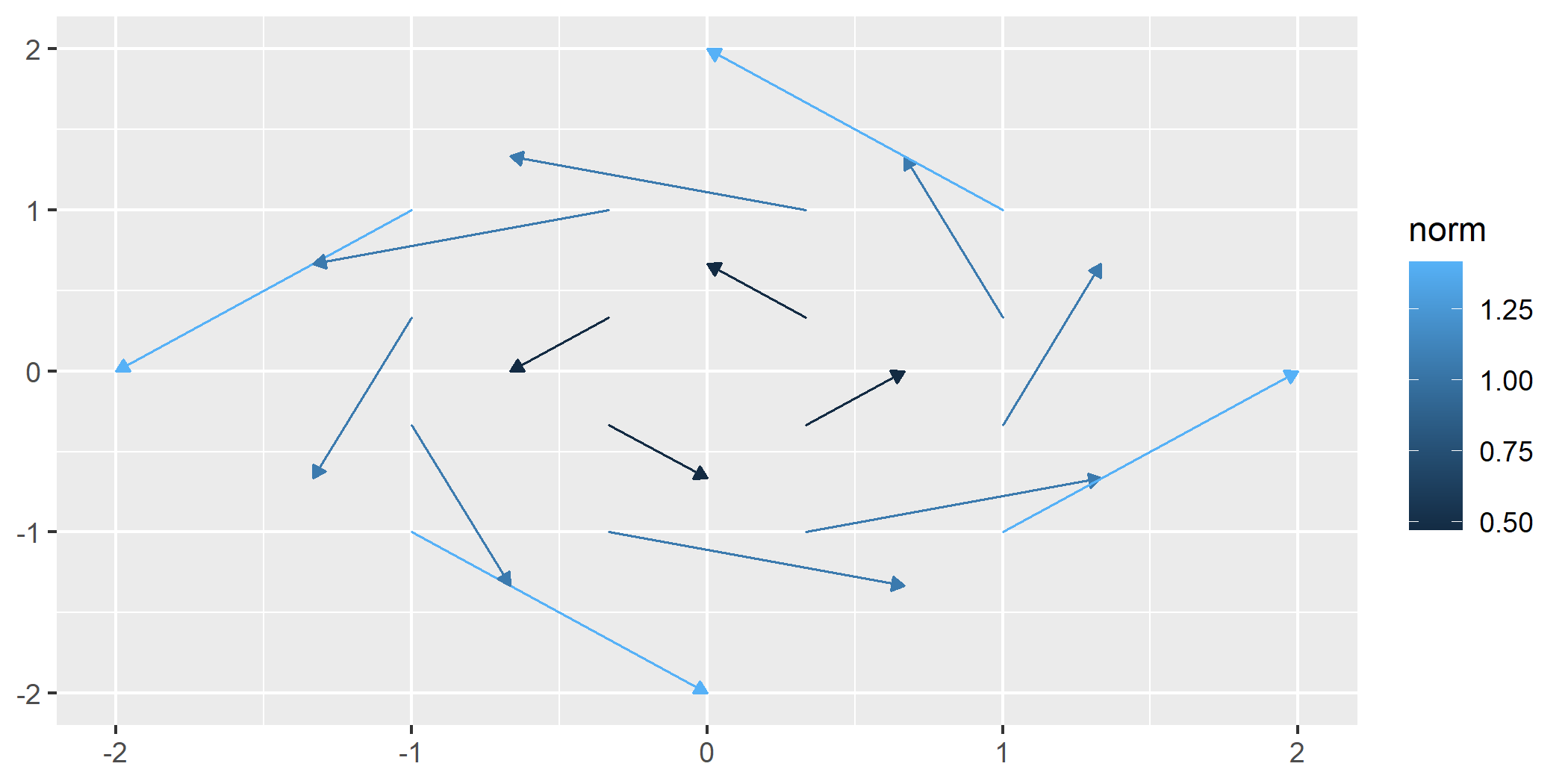
If we turn off normalization and centering, we get a raw look at the vector field data.
ggplot() +
  geom_vector_field(fun = f, n = 4, normalize = FALSE, center = FALSE)
geom_stream_field() and geom_stream_field2()
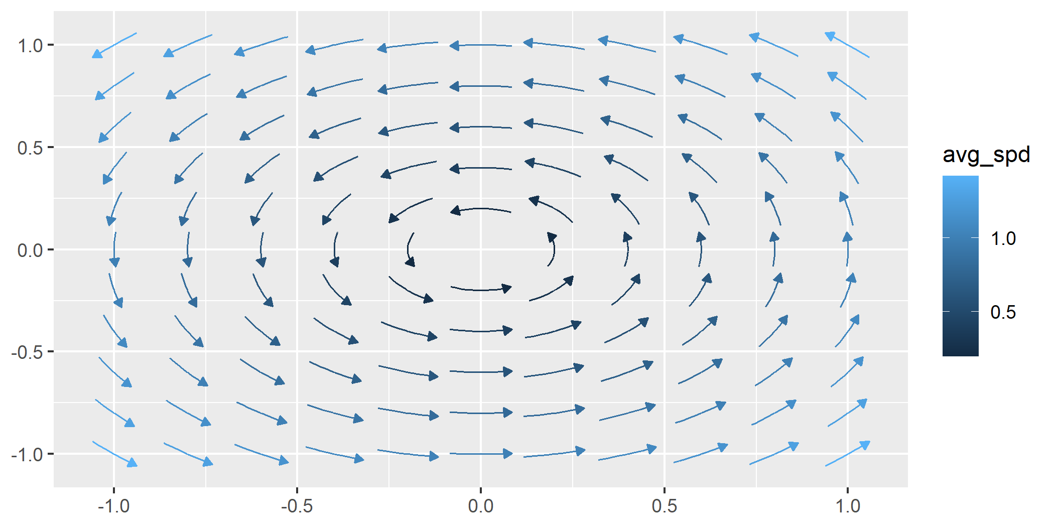
geom_stream_field(): Computes stream fields from a user-defined function and maps the average speed to color. Average speed is the overall rate at which a particle traverses the shown stream. If the displacement vector has length $|\mathbf{d}|$ and it takes time $t$, the integration time of streams, to traverse that distance, then the average speed is given by $\text{Average Speed} = \frac{|\mathbf{d}|}{t}$
ggplot() +
  geom_stream_field(fun = f)
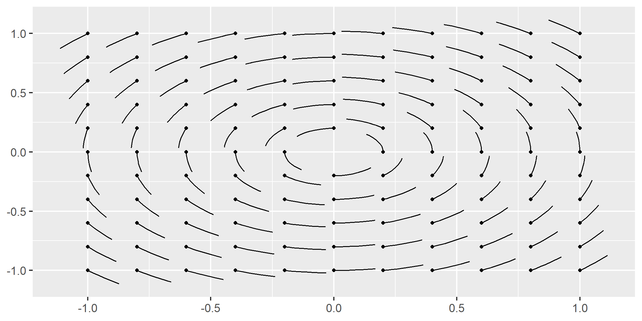
geom_stream_field2(): Similar togeom_stream_field(), but removes mapping, arrow heads, and designates stream origins with a dot.
ggplot() +
  geom_stream_field2(fun = f)
geom_stream_field()options
geom_stream_field() maintains similar options to
geom_vector_field(). Some arguments yield slightly different behavior.
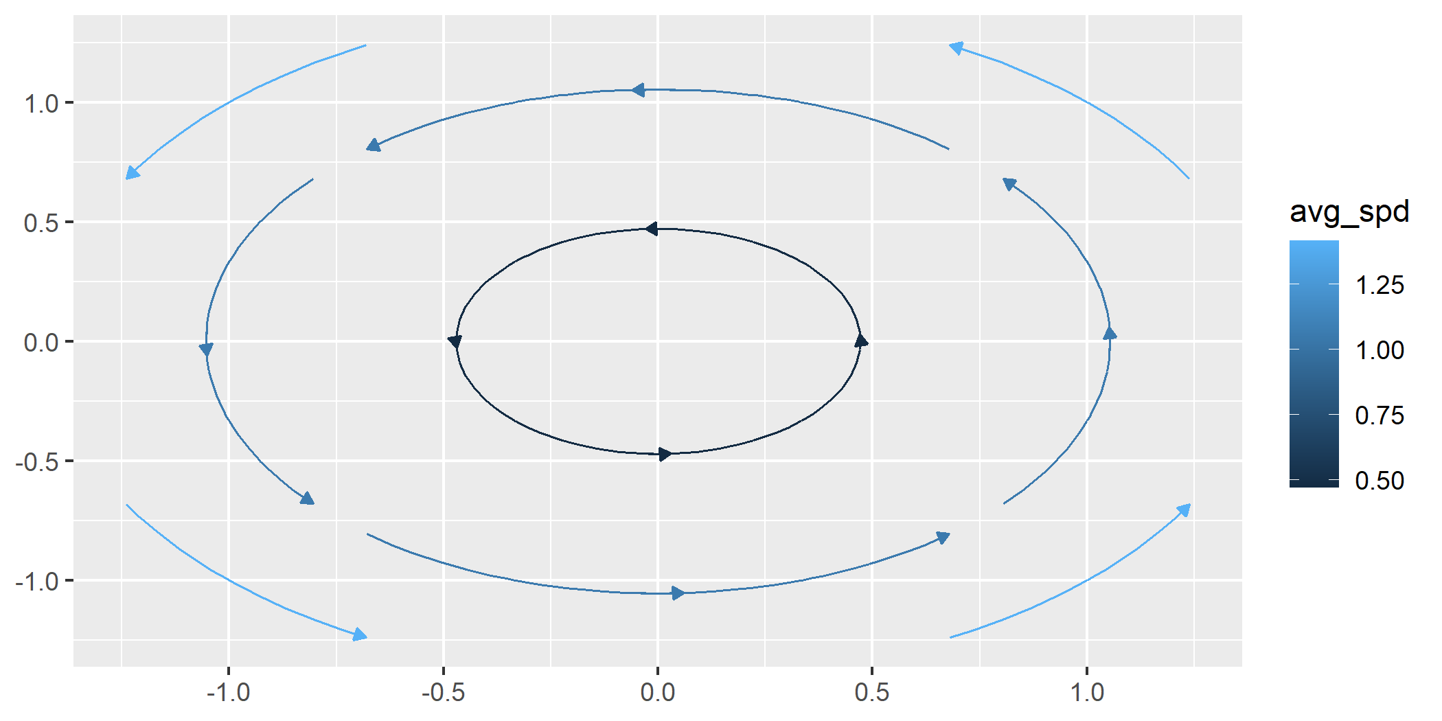
Length
By adjusting the L parameter, we can control the length of each
stream.
ggplot() +
  geom_stream_field(fun = f, n = 4, L = .8)
Normalization
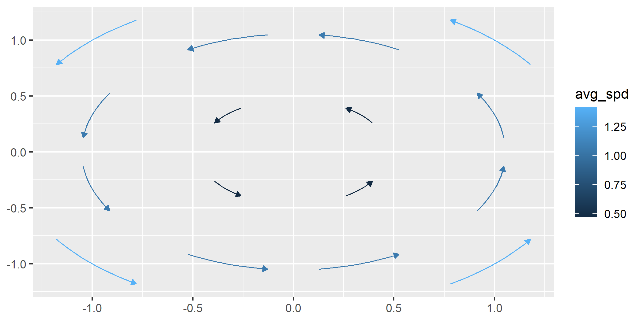
By default, the lengths of each stream is normalized to be the same length. By turning normalization off, each stream becomes time normalized. In other words, each stream grows for the same amount of time.
ggplot() +
  geom_stream_field(fun = f, n = 4, normalize = FALSE)
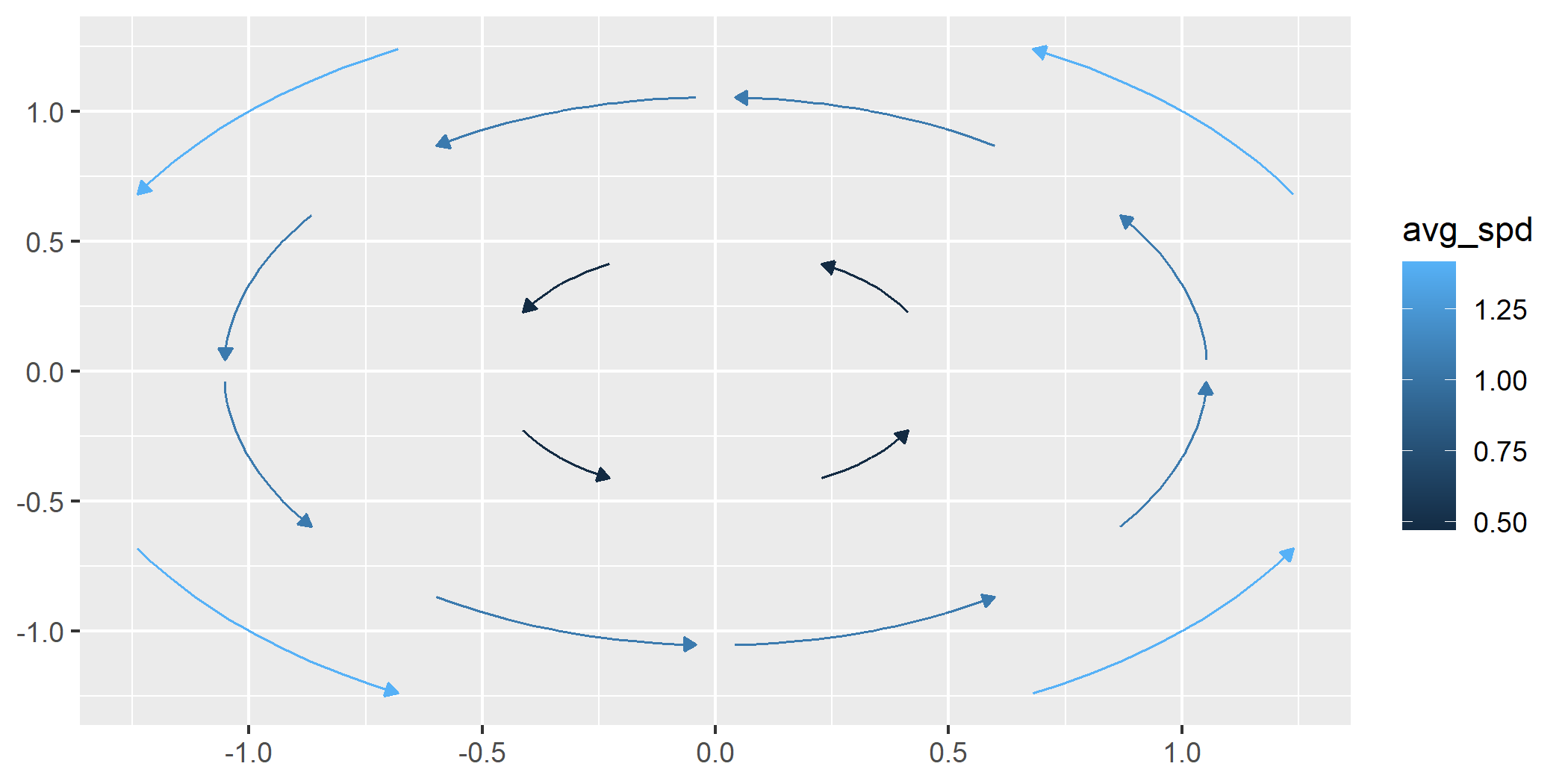
We can control the length of the longest stream when normalize = FALSE
by altering the L argument.
ggplot() +
  geom_stream_field(fun = f, n = 4, normalize = FALSE, L = .8)
Time
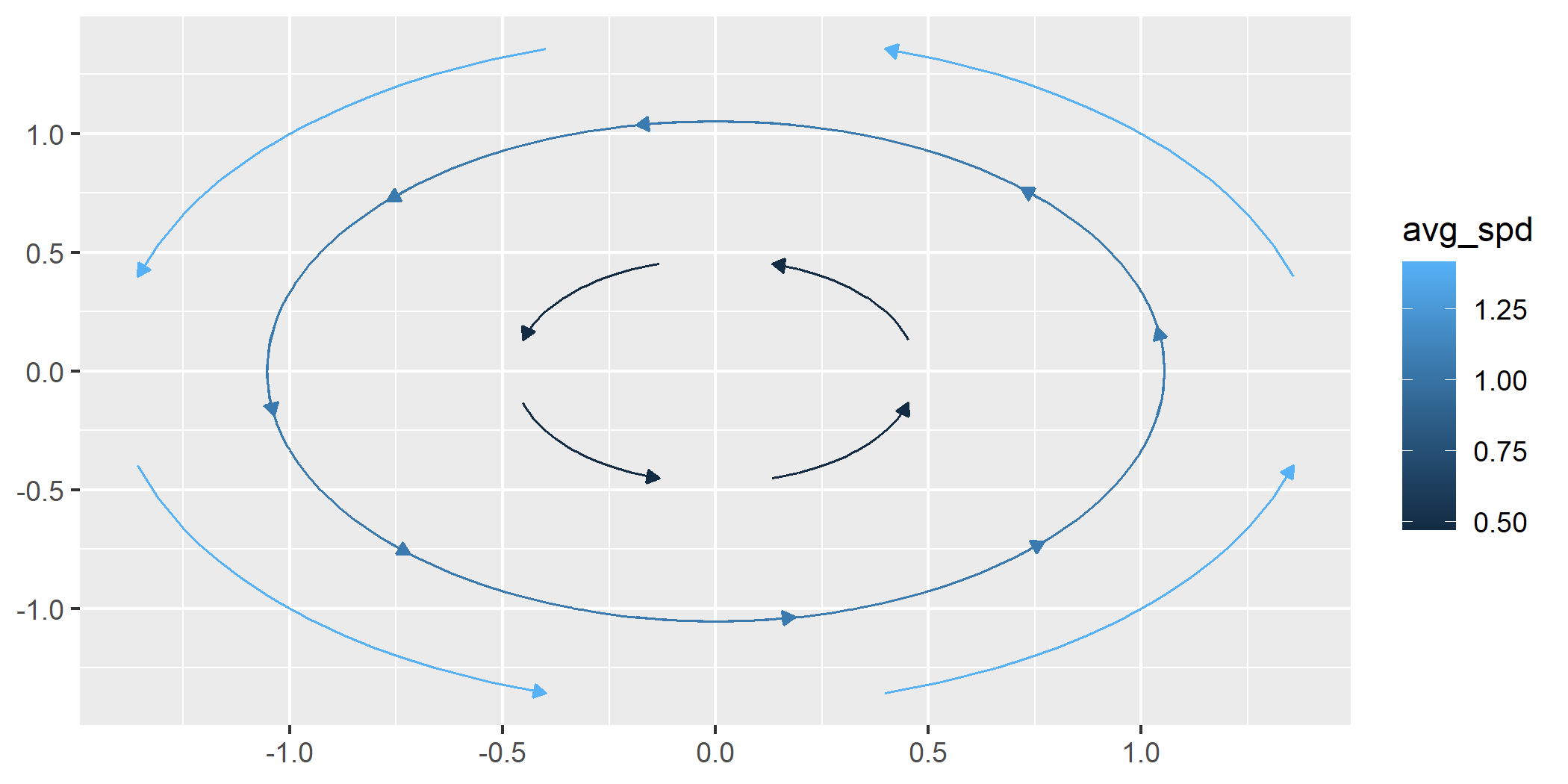
When normalize = FALSE, we can grow each stream for the same amount of
time by using the T parameter.
ggplot() +
  geom_stream_field(fun = f, n = 4, normalize = FALSE, T = .5)
geom_gradient_field() and geom_gradient_field2()
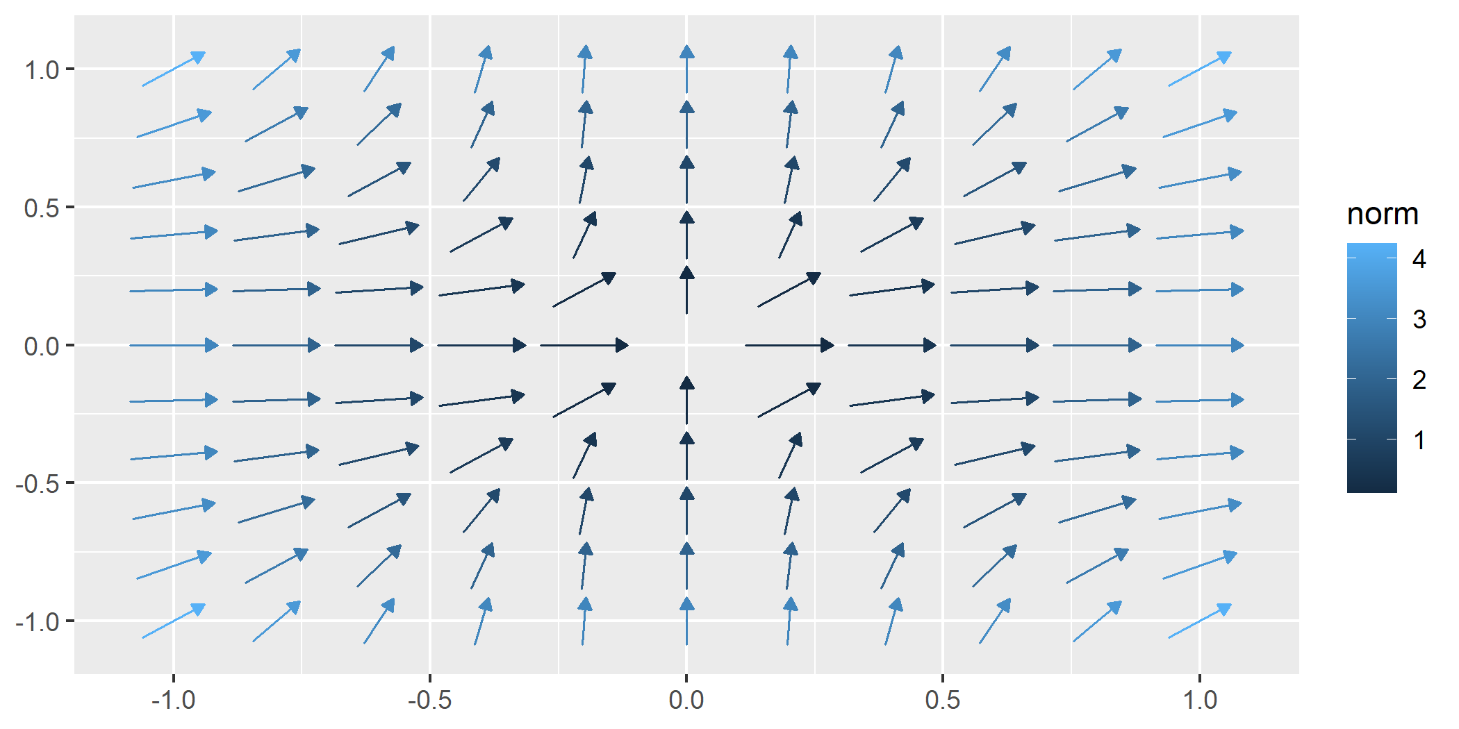
The geom_gradient_field() function computes and visualizes gradient
fields derived from scalar functions and displays the gradient vector
field of a scalar function, $f(x, y)$. The gradient is given by:
$$ \nabla f(x, y) = \left( \frac{\partial f}{\partial x}, \frac{\partial f}{\partial y} \right) $$
This vector field points in the direction of the greatest rate of increase of the scalar function. The function numerically evaluates these partial derivatives and visualizes the resulting vectors.
- Gradient Fields as Vectors The resulting vector field has all the
same defaults and same options as
geom_vector_field()
field <- function(v) {
  x <- v[1]
  y <- v[2]
  x^3 + y^3
}

ggplot() +
  geom_gradient_field(fun = field)
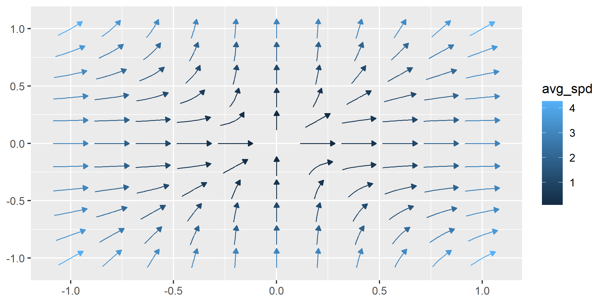
- Gradient Fields as Streams The resulting stream field has all the
same defaults and same options as
geom_stream_field()
ggplot() +
  geom_gradient_field(fun = field, type = "stream")
geom_potential()
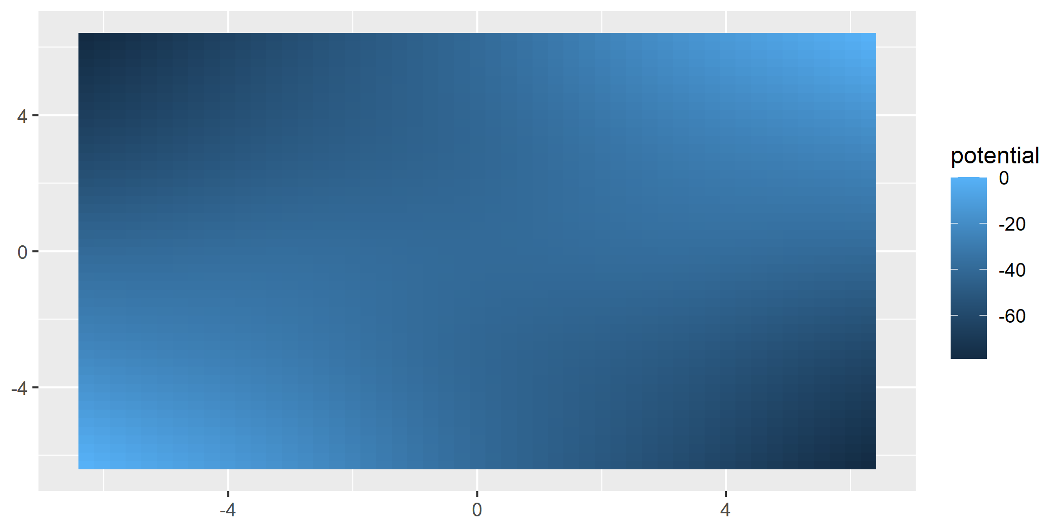
A potential function represents a scalar field whose gradient produces a vector field. It is used to describe conservative vector fields which exist when the curl of the vector field is 0.
The geom_potential() function computes and visualizes the scalar
potential function for a given conservative vector field. The input
function must represent a 2D vector field and the output is the
corresponding potential function. If the input field is not
conservative, the function checks this condition numerically based on a
tolerance parameter. The tolerance determines how strictly the field
must satisfy the conservation condition.
conservative_fun <- function(v) {
 x <- v[1]
 y <- v[2]
 c(sin(x) + y, x - sin(y))
}

ggplot() +
  geom_potential(fun = conservative_fun, xlim = c(-2*pi, 2*pi), ylim = c(-2*pi, 2*pi))
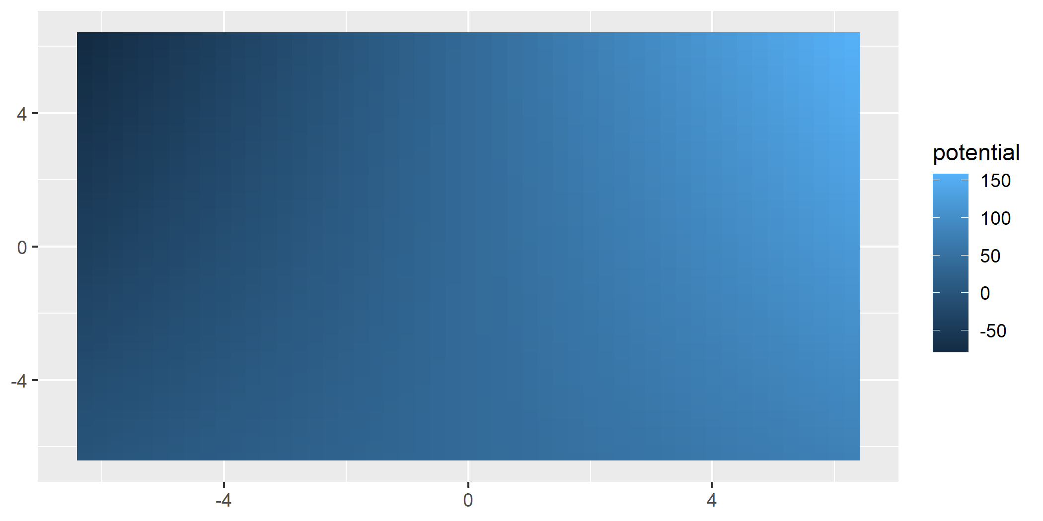
The tol parameter can be adjusted to control the sensitivity of the
conservativeness check. Decreasing the tolerance makes the check
stricter, while increasing it allows for more numerical error. You can
turn this functionality on with verify_conservative = TRUE.
non_conservative_fun <- function(v) {
 x <- v[1]
 y <- v[2]
 c(-y, x)
}

ggplot() +
  geom_potential(fun = non_conservative_fun,
                 xlim = c(-2*pi, 2*pi), ylim = c(-2*pi, 2*pi),
                 verify_conservative = TRUE,
                 tol = 1e-6
                 )
#> Warning: ! The provided vector field does not have a potential function everywhere
#>   within the specified domain.
#> → Ensure that the vector field satisfies the necessary conditions for a
#>   potential function.
geom_vector() and geom_vector2()
So far, these layers have supported visualizing functions. ggvfields can also visualize raw data.
Generate sample wind data:
set.seed(1234)
n <- 10

wind_data <- data.frame(
  lon = rnorm(n),
  lat = rnorm(n),
  dir = runif(n, -pi/2, pi/2),
  spd = rchisq(n, df = 2)
) |>
  within({
    fx    <- spd * cos(dir)          # Compute the x-component of the vector
    fy    <- spd * sin(dir)          # Compute the y-component of the vector
    xend  <- lon + fx                # Compute the end x-coordinate
    yend  <- lat + fy                # Compute the end y-coordinate
  })

round(wind_data, digits = 2) |> head(6)
#>     lon   lat   dir   spd  yend xend    fy    fx
#> 1 -1.21 -0.48  0.17  3.55  0.11 2.29  0.59  3.50
#> 2  0.28 -1.00  0.46  2.19 -0.03 2.24  0.97  1.96
#> 3  1.08 -0.78 -0.59  2.99 -2.44 3.56 -1.66  2.48
#> 4 -2.35  0.06  0.38 10.81  4.10 7.68  4.04 10.03
#> 5  0.43  0.96 -0.53  3.45 -0.80 3.40 -1.76  2.97
#> 6  0.51 -0.11  0.01  3.91 -0.09 4.41  0.02  3.91
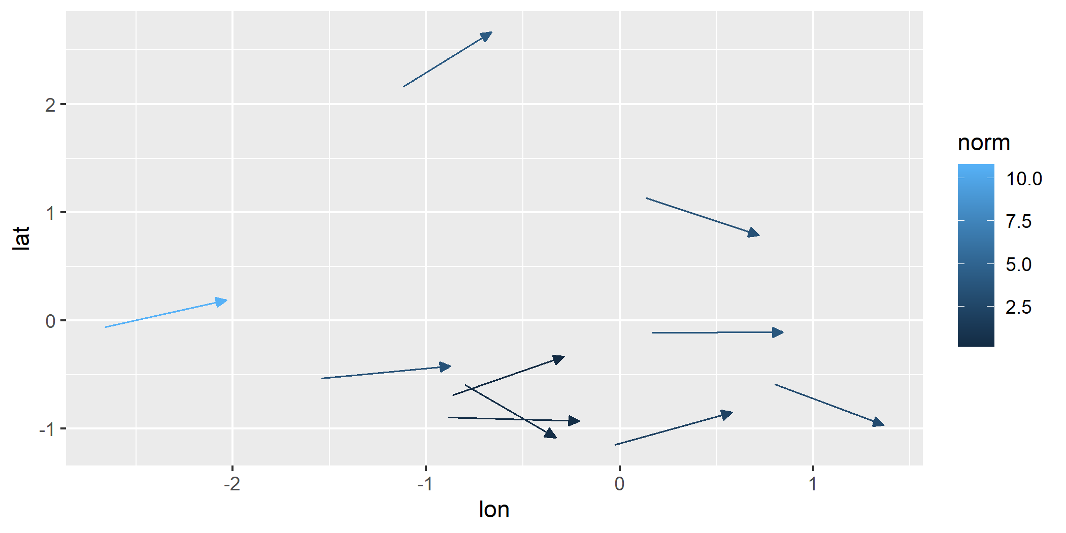
geom_vector(): By default, this maps the norm (magnitude) of a vector to its color.
ggplot(wind_data) +
  geom_vector(aes(x = lon, y = lat, xend = xend, yend = yend))
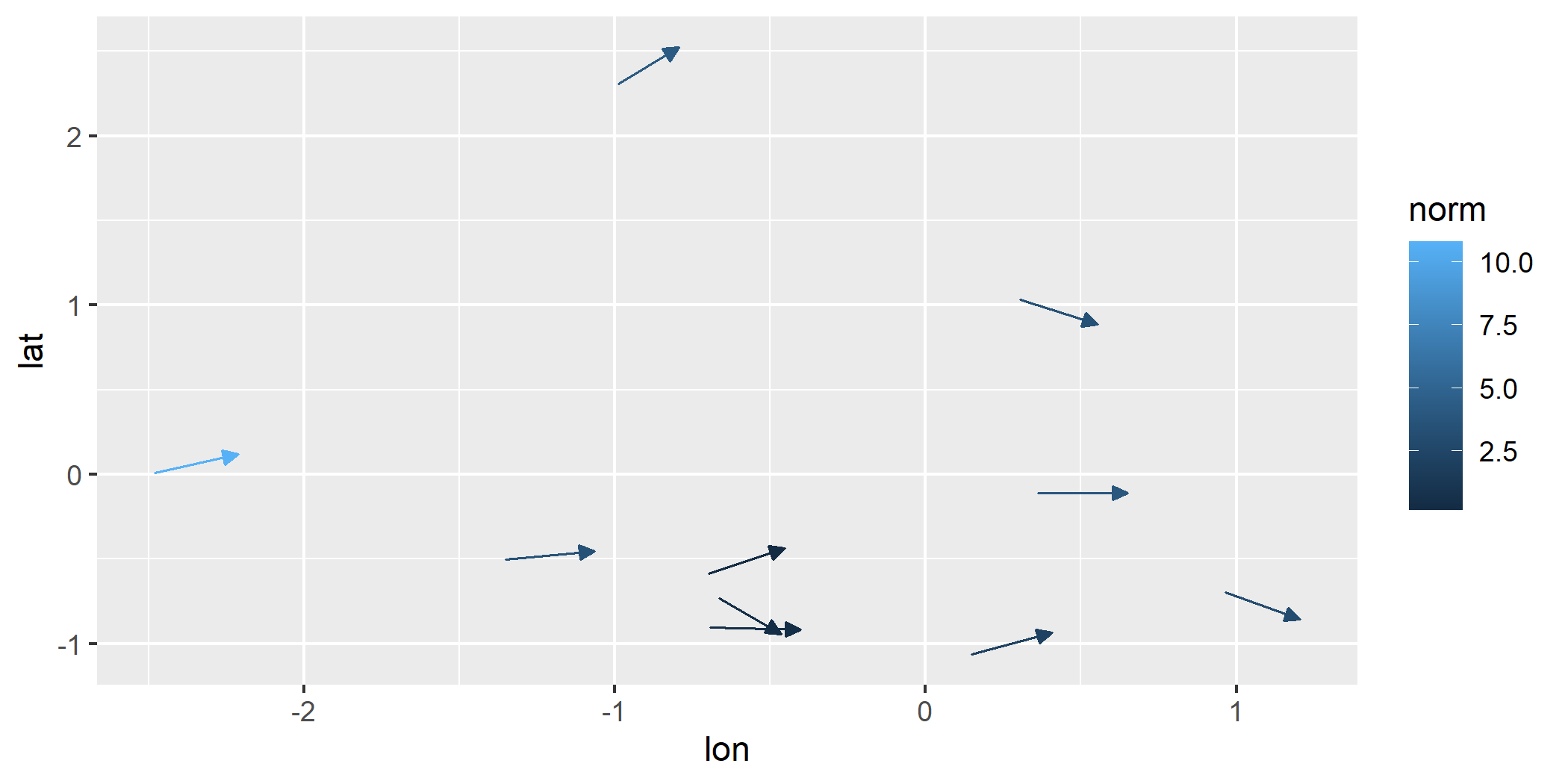
geom_vector() also supports both xend/yend format as well as
fx/fy format.
ggplot(wind_data) +
  geom_vector(aes(x = lon, y = lat, fx = fx, fy = fy))
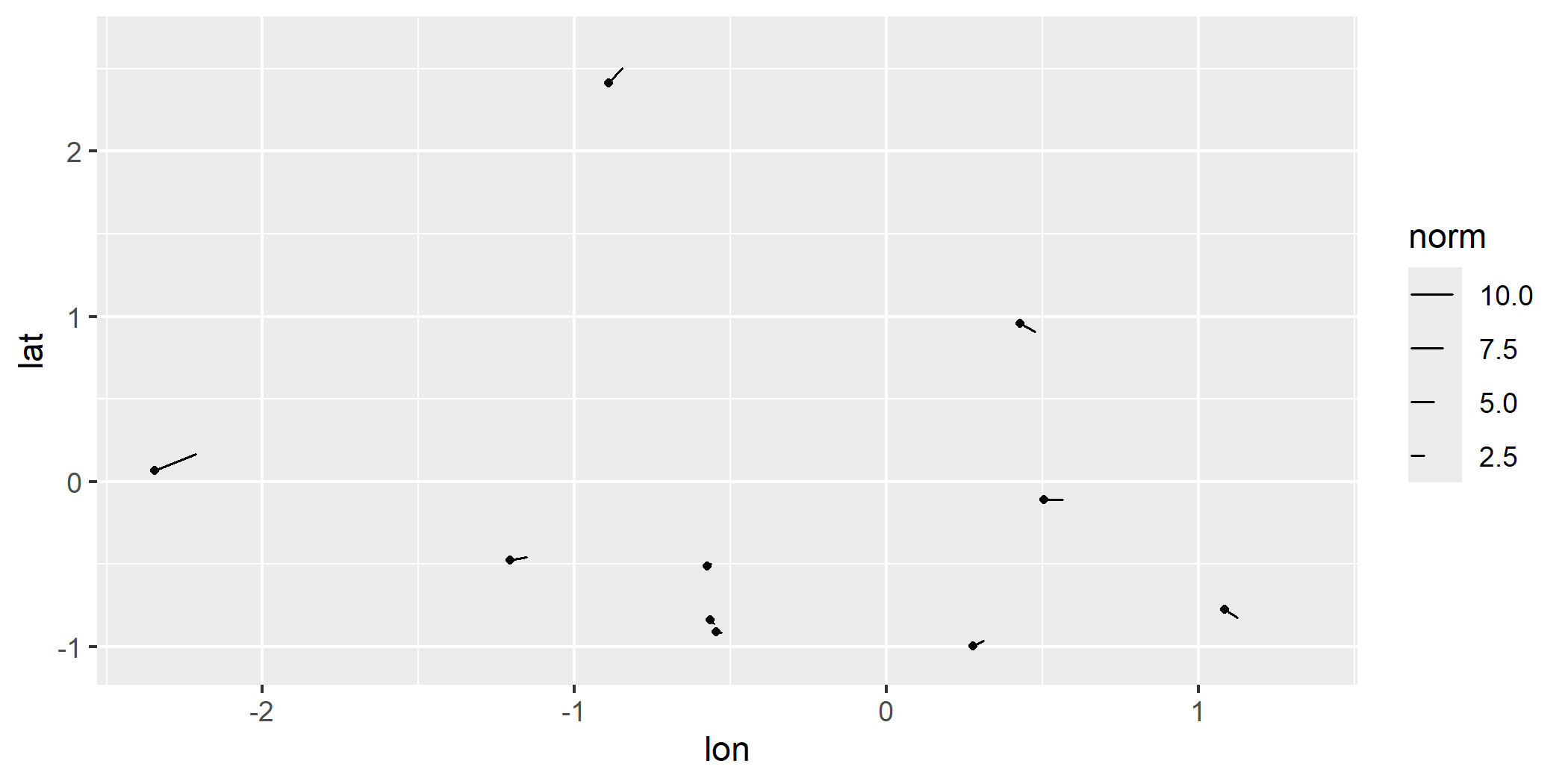
geom_vector2(): Maps the norm of a vector directly to its length. This provides a more intuitive representation of magnitude. This is done by mappinglength = after_stat(norm)by default.
ggplot(wind_data) +
  geom_vector2(aes(x = lon, y = lat, fx = fx, fy = fy))
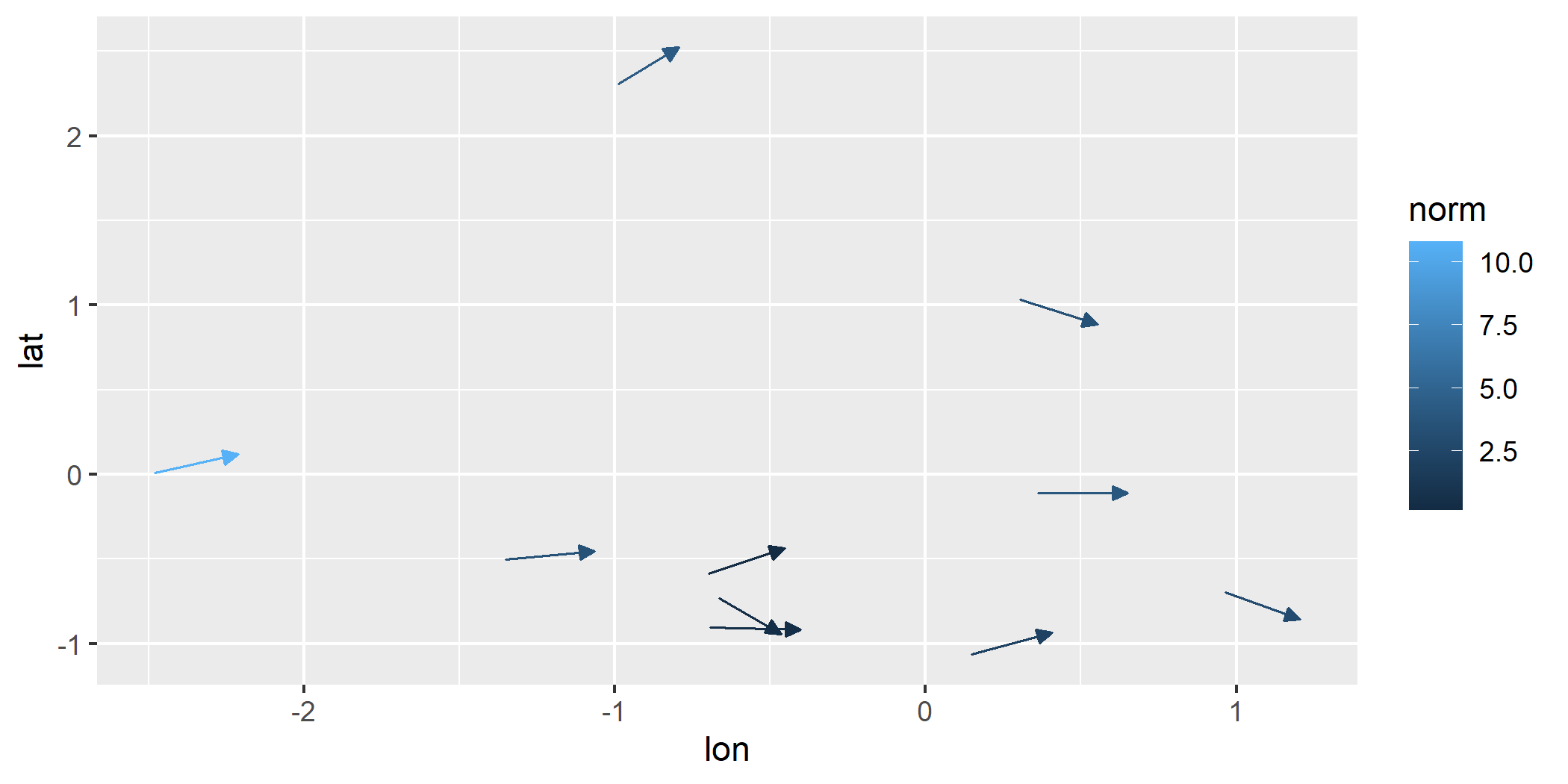
Polar Coordinates Support
Both geom_vector() and geom_vector2() also support polar
coordinates, where vectors are specified using magnitude (distance)
and direction (angle). Instead of providing Cartesian components
(fx, fy or xend, yend), users can directly supply polar data.
This feature simplifies workflows for directional data and works for all
subsequent relevant functions that handle polar coordinates.
Polar coordinates can be visualized like this:
ggplot(wind_data) +
  geom_vector(aes(x = lon, y = lat, distance = spd, angle = dir))
Normalize and Center
-
normalize: When set toTRUE, this option scales each vector to have a unit length, which can help avoid overplotting in dense vector fields. This is especially useful when the direction of vectors is more important than their magnitude. However, it’s important to note that normalize is different from mapping the norm of the vector to the length aesthetic. While normalization ensures that all vectors are visually uniform in length, mapping the norm to length preserves the relative differences in magnitude by varying the vector lengths based on their actual norms. -
center: By default,centeris also set toTRUE, meaning the midpoint of each vector is placed at the corresponding (x,y) coordinate, effectively “centering” the vector on the point. When center isFALSE, the base of the vector is anchored at the (x,y) point, and the vector extends outward from there.
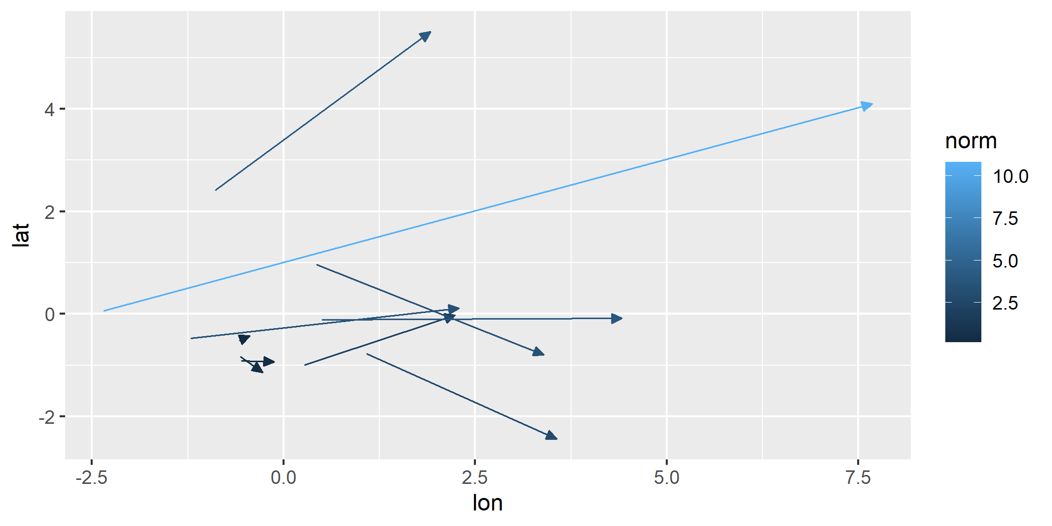
The example below turns off this default behavior:
ggplot(wind_data) +
  geom_vector(aes(x = lon, y = lat, fx = fx, fy = fy), center = FALSE, normalize = FALSE)
Modeling Features
ggvfields offers techniques for smoothing noisy vector field data
geom_stream_smooth() and geom_vector_smooth()
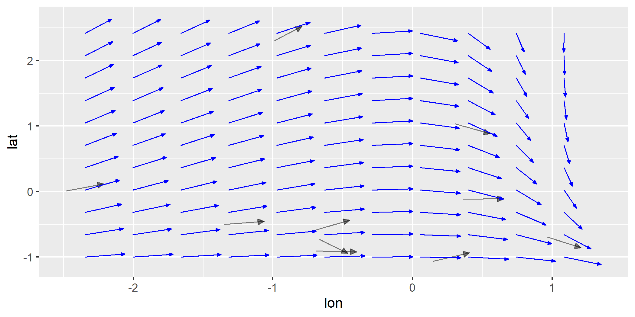
geom_stream_smooth() uses a dynamical systems approach and
geom_vector_smooth() offers a multivariate regression approach that
accounts for uncertainty.
geom_stream_smooth()
ggplot(wind_data, aes(x = lon, y = lat, fx = fx, fy = fy)) +
  geom_vector(alpha = .5, color = "black") +
  geom_stream_smooth(aes(x = lon, y = lat, fx = fx, fy = fy))
geom_vector_smooth()
Provides smoothed estimates of vector fields by applying statistical techniques to observed vectors.
Smoothing is performed using a multivariate linear model defined by:
$$ \begin{pmatrix} \hat{dx} \ \hat{dy} \end{pmatrix} = \beta_0 + \beta_1 x + \beta_2 y + \beta_3 xy $$
where $\beta$ are coefficients estimated by ordinary least squares
(OLS). This approach captures linear and interaction effects to
approximate the underlying vector field. This function also creates a
prediction interval around the vector specified by the conf_level
argument and defaults to .95.
- Evaluating Specific Points:
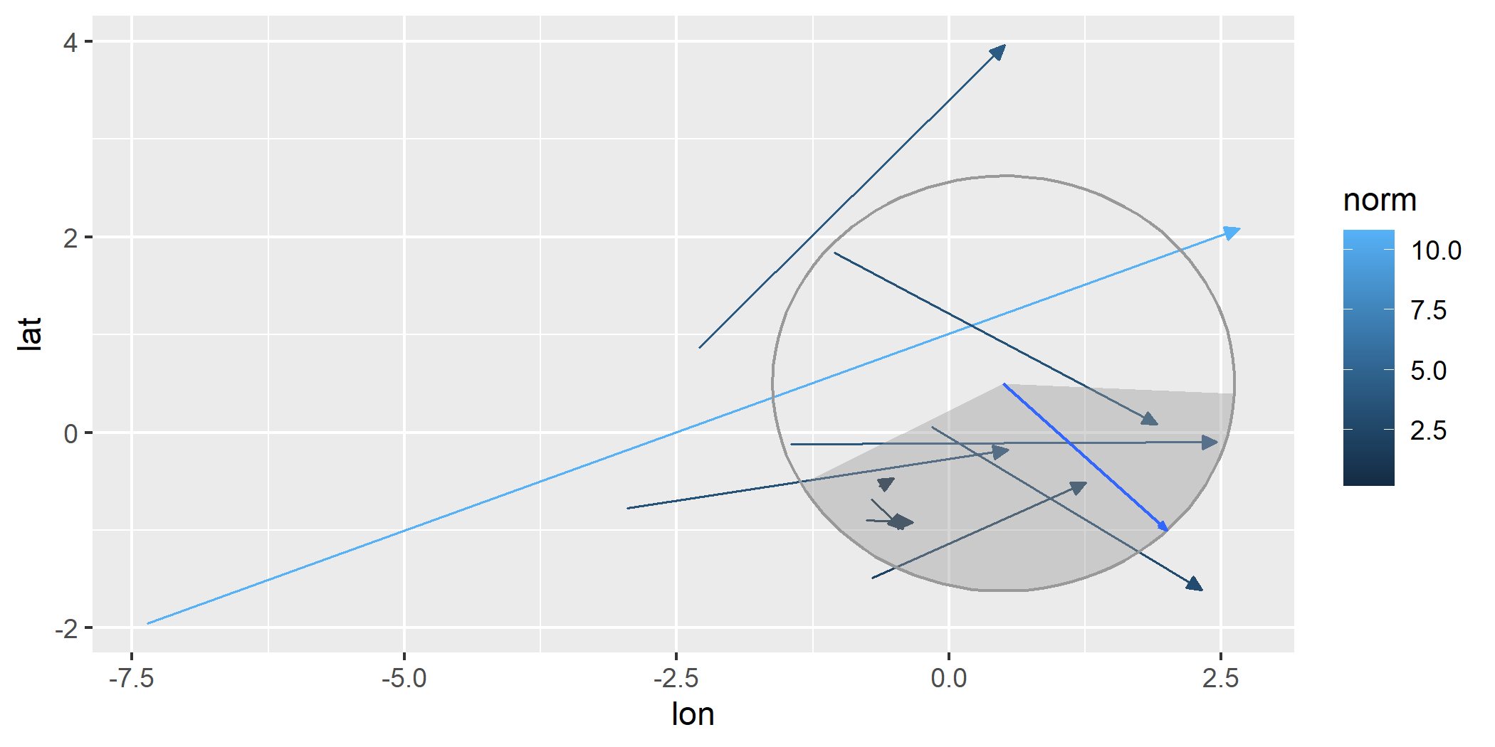
When evaluation points are provided, smoothing is performed at those locations and prediction intervals can be visualized using either wedges or ellipses to indicate uncertainty.
eval_point <- data.frame(x = .5, y = .5)

ggplot(wind_data, aes(x = lon, y = lat, fx = fx, fy = fy)) +
  geom_vector(normalize = FALSE) +
  geom_vector_smooth(eval_points = eval_point) +
  lims(x = c(-7,10), y = c(-3,3))
#> Warning: Removed 2 rows containing missing values or values outside the scale range
#> (`geom_stream()`).

- Using Wedges to Visualize Uncertainty:
ggplot(wind_data, aes(x = lon, y = lat, fx = fx, fy = fy)) +
  geom_vector(normalize = FALSE) +
  geom_vector_smooth(eval_points = eval_point, pi_type = "wedge")
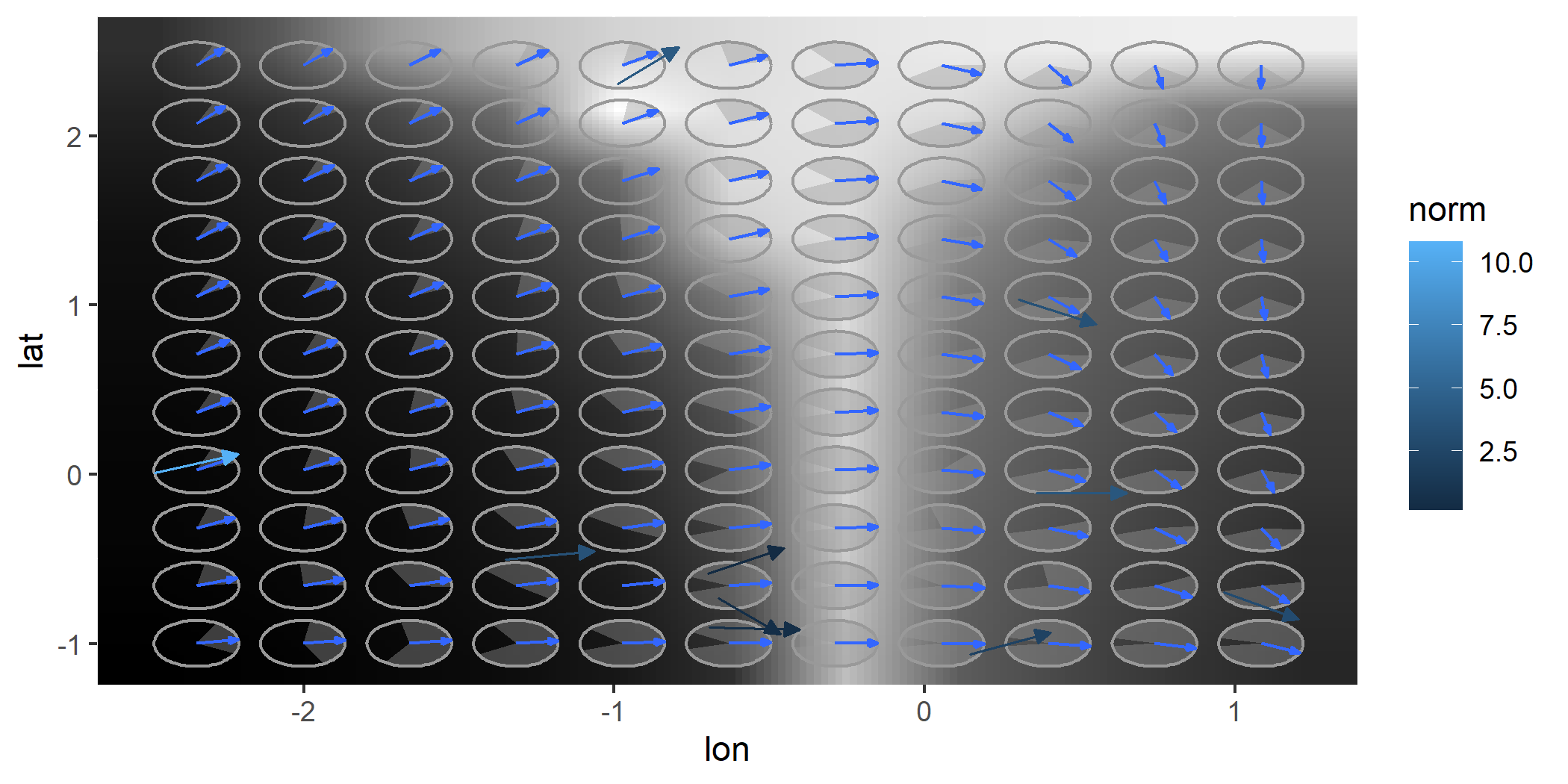
- Grid-Based Smoothing:
ggplot(wind_data, aes(x = lon, y = lat, fx = fx, fy = fy)) +
  geom_vector_smooth(pi_type = "wedge") +
  geom_vector()
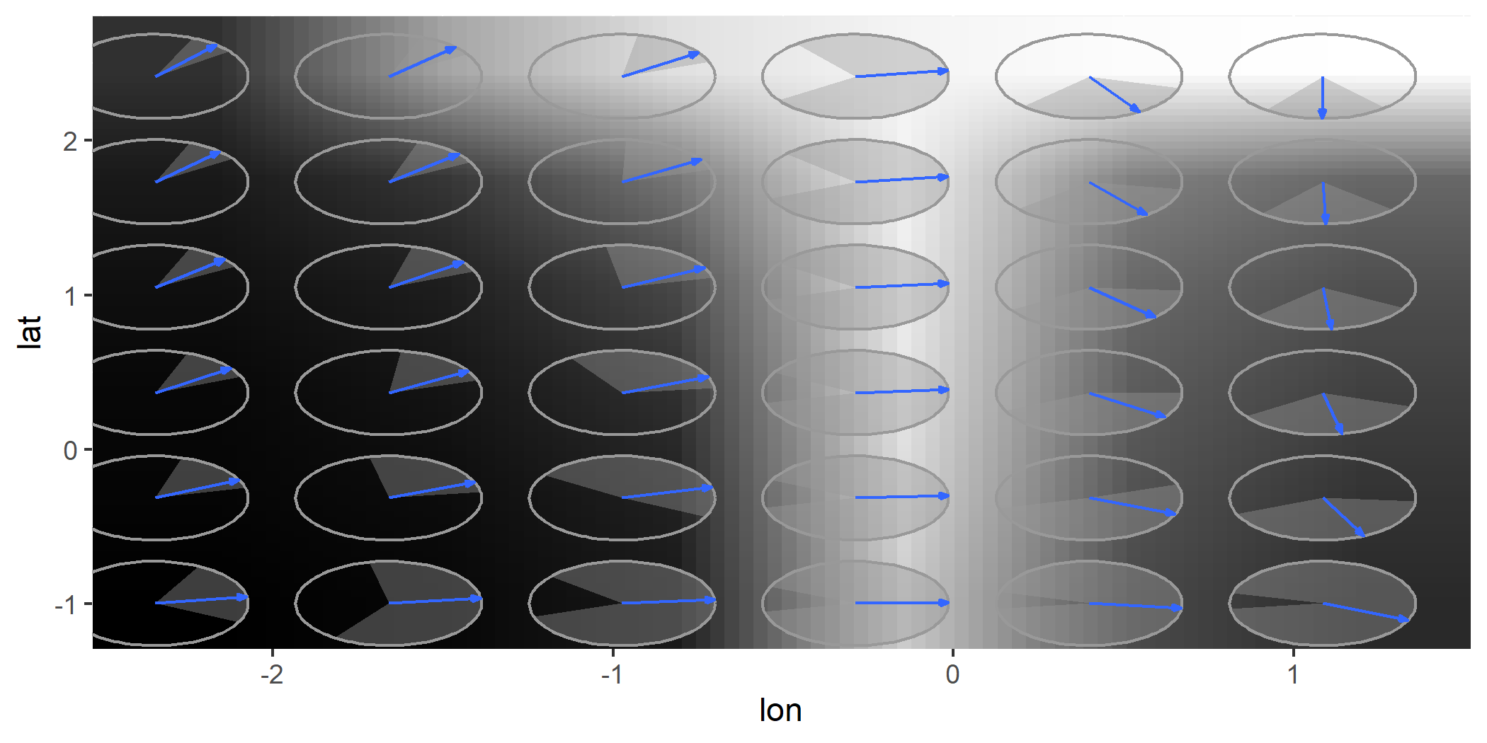
- Custom Grid Resolution:
ggplot(wind_data, aes(x = lon, y = lat, fx = fx, fy = fy)) +
  geom_vector_smooth(n = 6, pi_type = "wedge")
- Altering Confidence Level
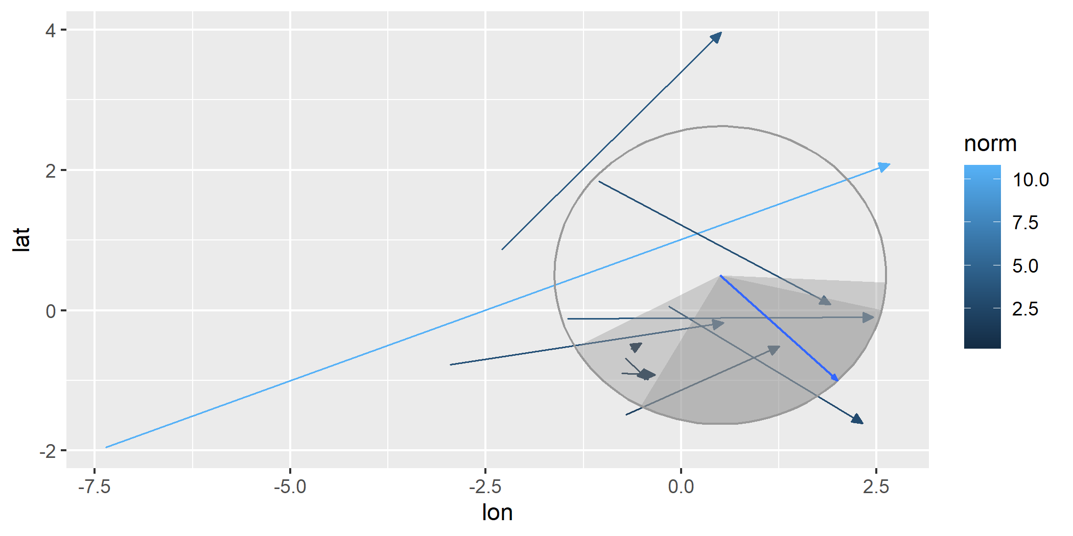
For all options, you can change the confidence level from the default to
another value by using the conf_level argument.
ggplot(wind_data, aes(x = lon, y = lat, fx = fx, fy = fy)) +
  geom_vector(normalize = FALSE) +
  geom_vector_smooth(eval_points = eval_point, pi_type = "wedge") +
  geom_vector_smooth(eval_points = eval_point, pi_type = "wedge", conf_level = .7)
geom_gradient_smooth()
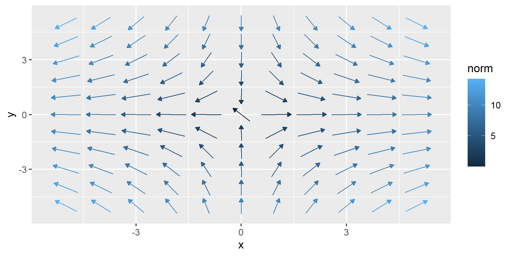
geom_gradient_smooth() creates a smoothed gradient field from raw
scalar data using a fitted linear model. This function estimates
gradients when only scalar values (z) are observed at spatial
locations (x, y). It is designed for cases where you have scalar
data and wish to estimate the gradient.
The gradients are computed numerically from a fitted scalar field model and the resulting gradient vectors are visualized using either streamlines or vector arrows.
f1 <- function(u) {
  x <- u[1]
  y <- u[2]
  x^2 - y^2
}

grid_data <- expand.grid(
  x = seq(-5, 5, length.out = 30),
  y = seq(-5, 5, length.out = 30)
)

set.seed(123)
grid_data$z <- apply(grid_data, 1, f1) + rnorm(nrow(grid_data), mean = 0, sd = 5)

ggplot(grid_data, aes(x = x, y = y, z = z)) +
  geom_gradient_smooth()
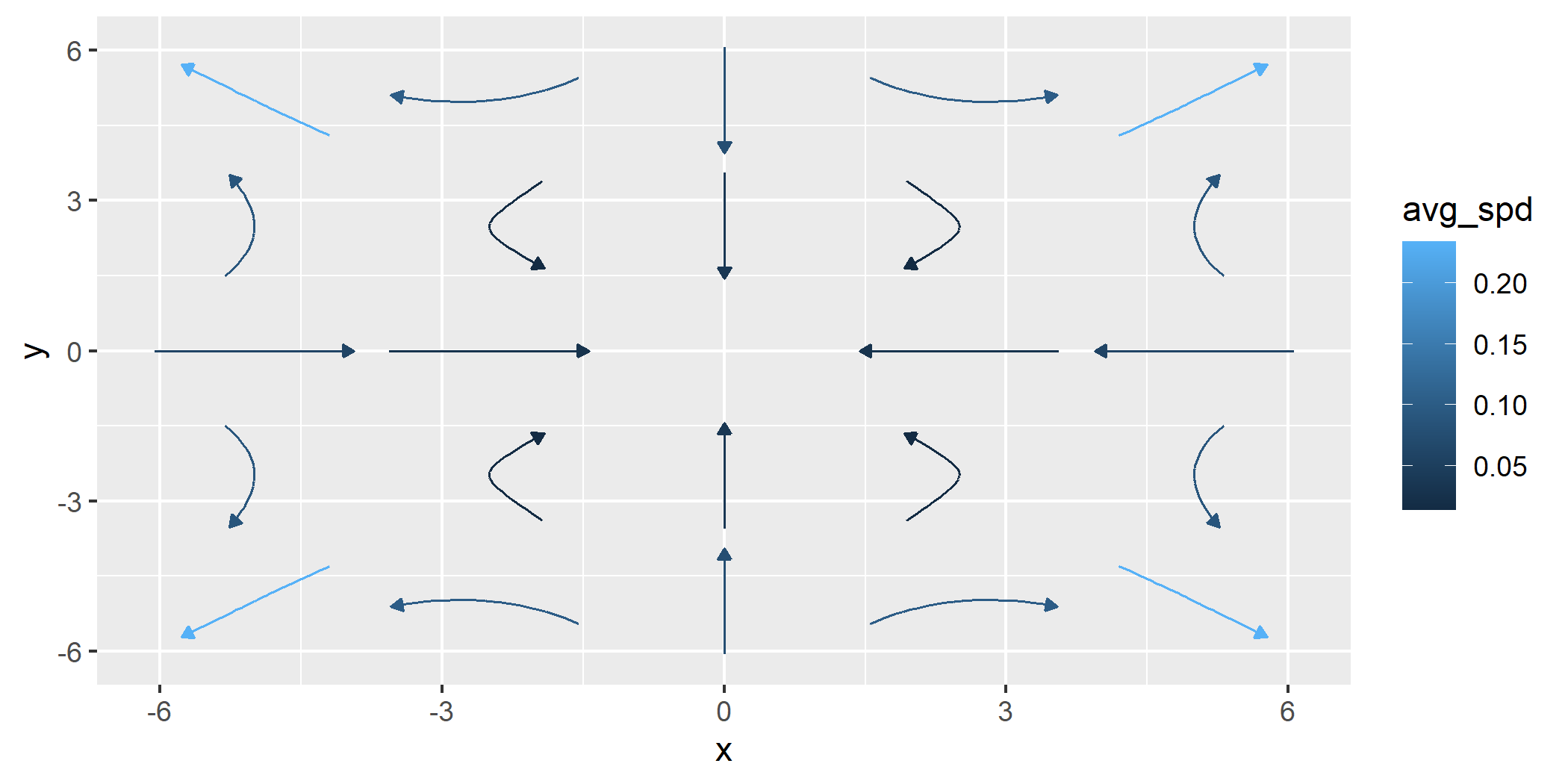
To illustrate how geom_gradient_smooth() can adapt to nonlinear
surfaces, we can change the formula used to fit the scalar field and
switch to a streamline visualization using type = "stream". The
example below uses a smooth but noisy scalar function that generates
curved gradients and fits a flexible smoothing model to capture these
variations.
h1 <- function(u) {
  x <- u[1]
  y <- u[2]
  sin(x / 2) * cos(y / 2)
}

grid_data$z <- apply(grid_data, 1, h1) + rnorm(nrow(grid_data), mean = 0, sd = 1)

ggplot(grid_data, aes(x = x, y = y, z = z)) +
  geom_gradient_smooth(formula = z ~ I(x^2) * I(y^2), n = 5, type = "stream")
Other Features
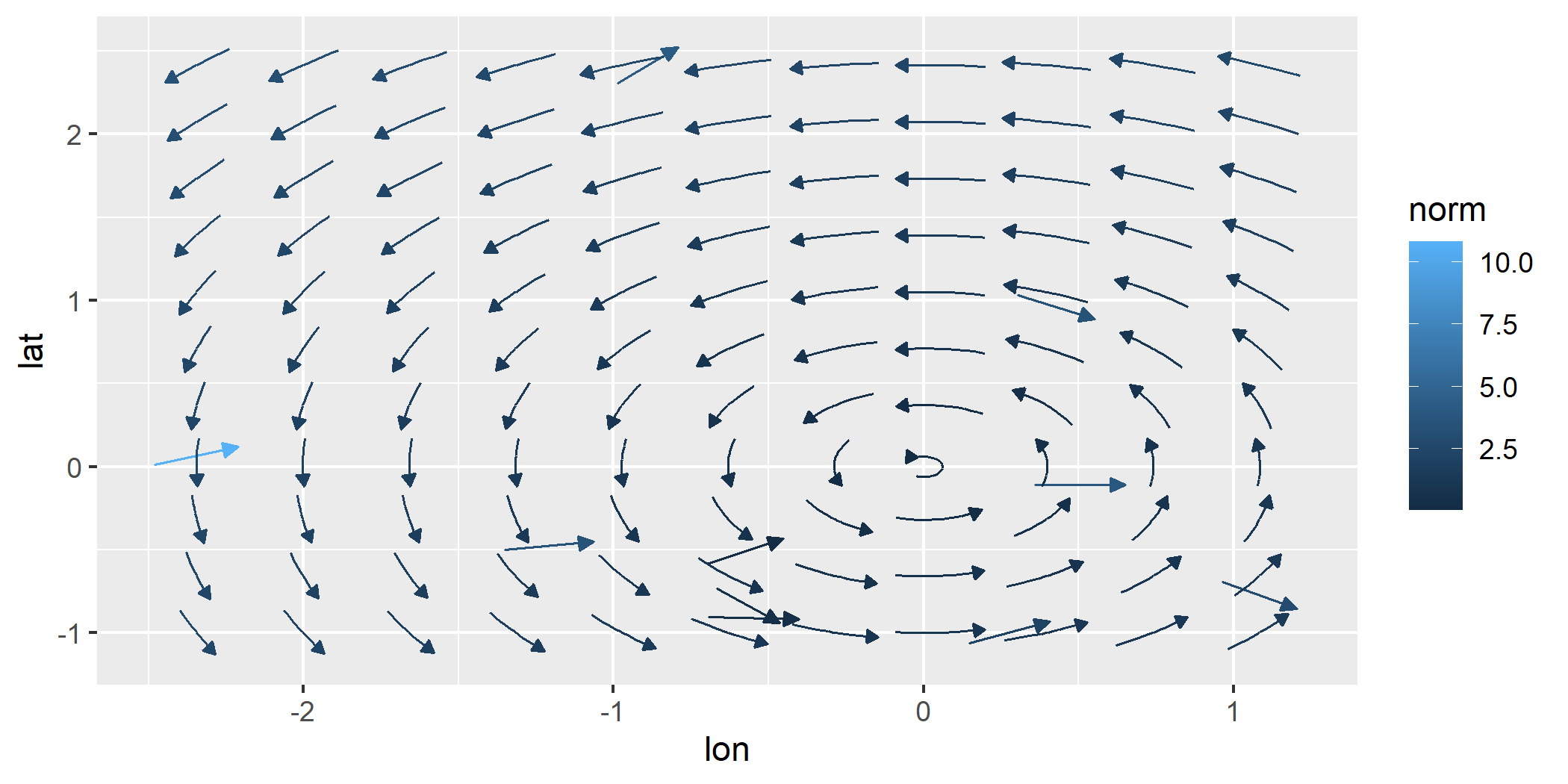
Automatic Limit Detection
These functions can automatically determine plot limits based on the
function provided. This happens when data exists in previous layers or
in the base ggplot object. This allows the limits to be inferred from
context. Customize limits with the xlim and ylim parameters if
needed for more control.
ggplot(data = wind_data, aes(x = lon, y = lat, fx = fx, fy = fy)) +
  geom_vector() +
  geom_stream_field(fun = f) # Automatically determines limits based on existing data
Custom Grids
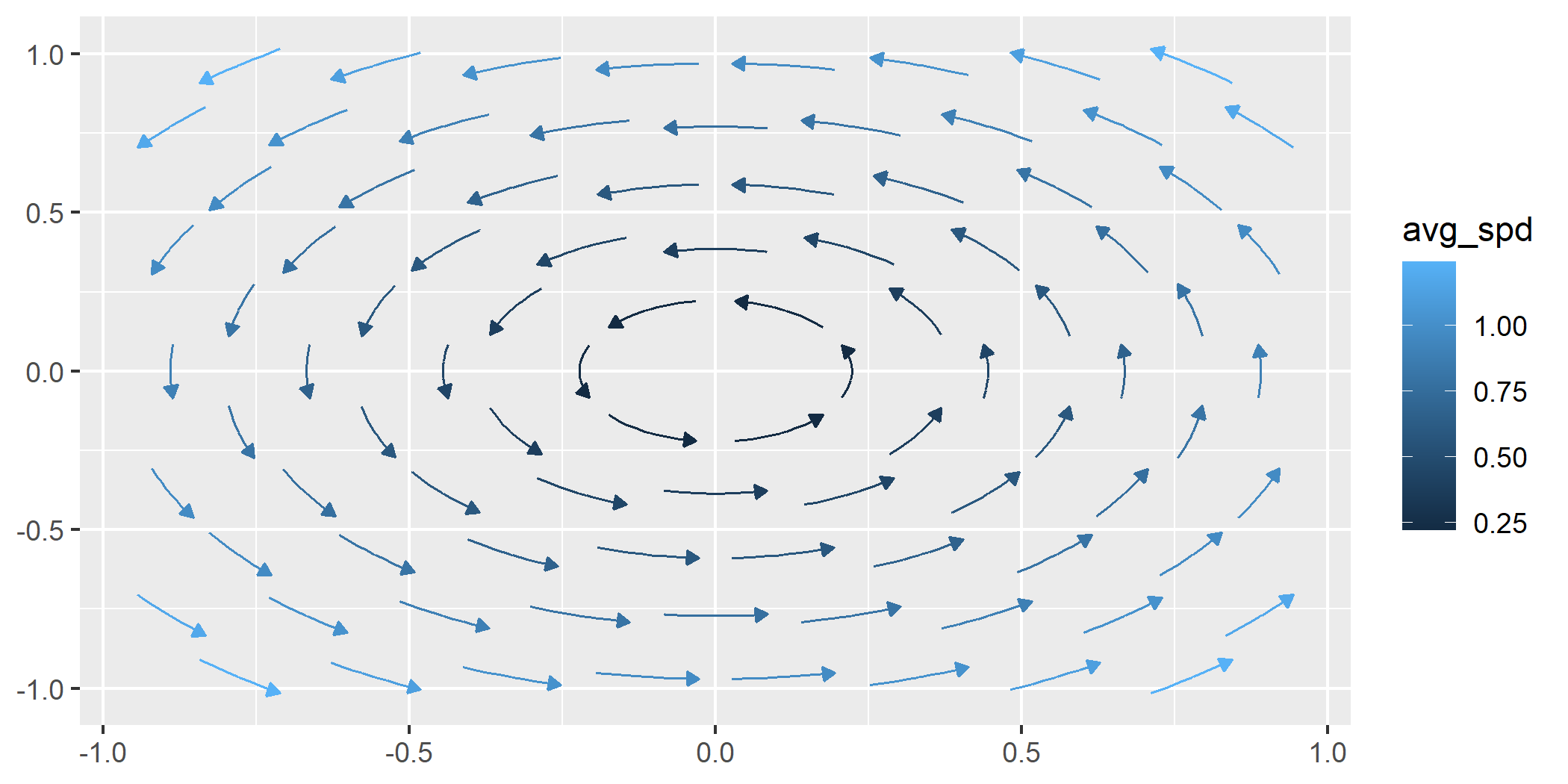
The geom_*_field functions allow the user to plot with custom
evaluation locations. The user can specify specific points to be
evaluated over the field or can also use a “hex” pattern.
ggplot() +
  geom_stream_field(fun = f, grid = "hex")
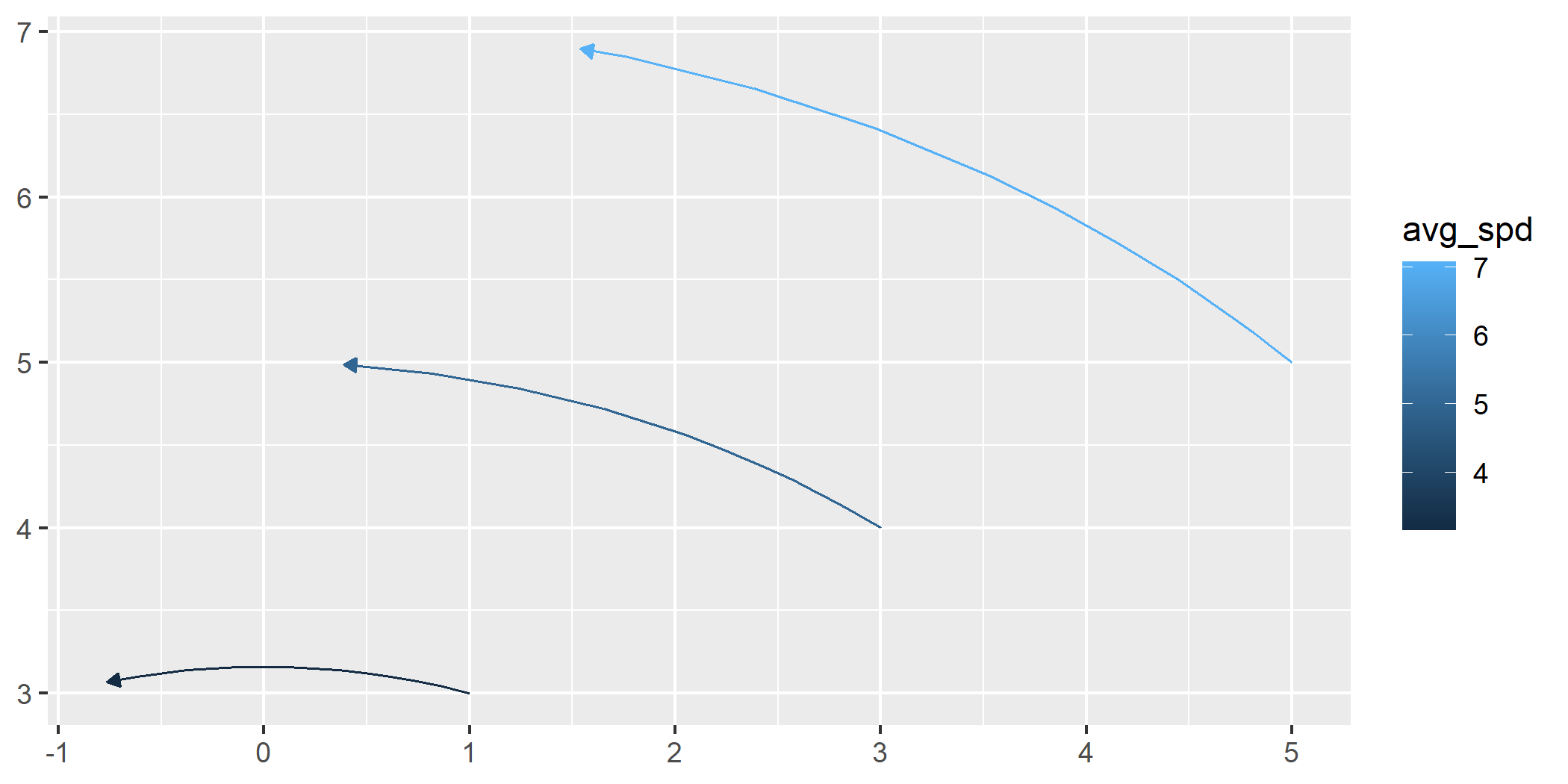
This shows a custom grid.
custom <- data.frame(x = c(1,3,5), y = c(3,4,5))

ggplot() +
  geom_stream_field(fun = f, grid = custom, normalize = FALSE, center = FALSE, L = 4)
License
This package is licensed under the MIT License.
Contact
For questions or feedback, please open an issue.