VanillaCalendar
Interactive Calendar and Date Picker Widget
An R interface to the 'Vanilla Calendar Pro' 'JavaScript' library (version 3.2.0, bundled) for creating interactive and customizable calendar widgets and date pickers. The package enables integration of modern calendar components in R and 'Shiny' applications, with support for date, month, year and time selection, popup input mode, theming, and in-place updates from the 'Shiny' server.
VanillaCalendar
An htmlwidget bringing
Vanilla Calendar Pro to R and Shiny — a modern,
dependency-free calendar, date picker and time picker, configured from R.
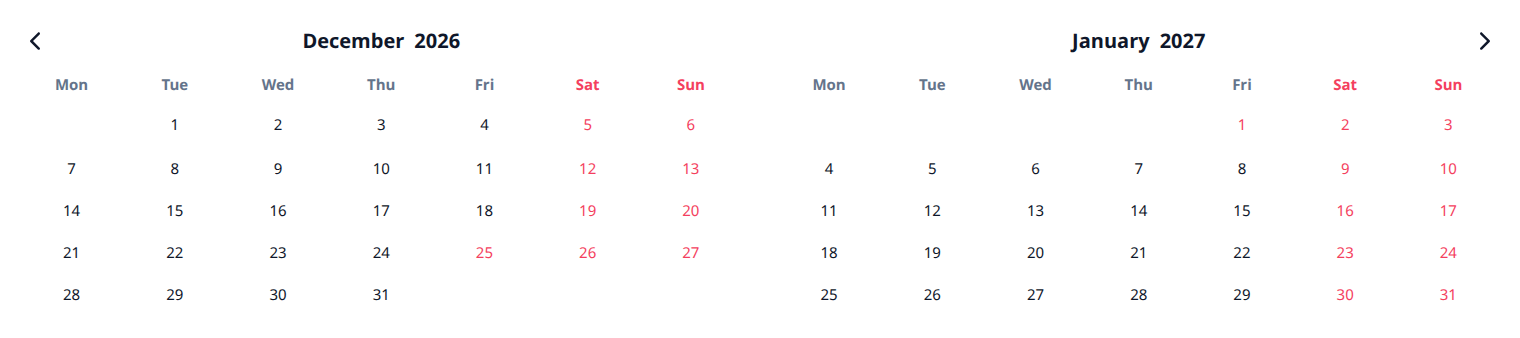
Bundles Vanilla Calendar Pro 3.2.0. No internet connection, no CDN and no JavaScript build step needed.
Install
remotes::install_github("ESCRI11/vanilla-calendar-r")
Use
library(VanillaCalendar)

VanillaCalendar()
Any option from the Vanilla Calendar Pro reference is passed straight through as a named list:
VanillaCalendar(
  options = list(
    type = "default",
    locale = "en",
    selectionDatesMode = "multiple",
    selectedDates = Sys.Date(),
    selectedTheme = "light"
  ),
  width = "500px",
  height = "400px"
)
R values are adapted for you: Date and POSIXct become the "YYYY-MM-DD"
strings the library expects, and options that must be JSON arrays are boxed, so
a single date works where the library wants a list. Misspelled option names
warn rather than being silently ignored.
In Shiny
Three steps: VanillaCalendarOutput() in the UI, renderVanillaCalendar() in
the server, and read the dates from input$<id>_selected. That is a complete
app:
library(shiny)
library(VanillaCalendar)

ui <- fluidPage(
  titlePanel("Pick a date"),
  VanillaCalendarOutput("cal", height = "400px"),
  textOutput("chosen")
)

server <- function(input, output) {
  output$cal <- renderVanillaCalendar(VanillaCalendar())
  output$chosen <- renderText({
    if (length(input$cal_selected) == 0) "Nothing picked yet."
    else format(input$cal_selected, "%A, %d %B %Y")
  })
}

shinyApp(ui, server)
input$cal_selected is a Date vector — Date(0) when nothing is selected,
so format() and min() never blow up on an empty calendar. Options change
what the user can do without changing any of the structure above:
# a date range instead of one date
output$cal <- renderVanillaCalendar(
  VanillaCalendar(list(selectionDatesMode = "multiple-ranged"))
)

# a text box with a popup, instead of a block of calendar
output$cal <- renderVanillaCalendar(
  VanillaCalendar(list(inputMode = TRUE), height = "auto")
)
Both apps ship with the package, so you can run them before writing anything:
# the app above, in full
shiny::runApp(system.file("examples/minimal", package = "VanillaCalendar"))

# the demo every screenshot below comes from
shiny::runApp(system.file("examples/gallery", package = "VanillaCalendar"))
Selecting dates
selectionDatesMode takes "single", "multiple" or "multiple-ranged".
Whatever the user picks arrives in input$<id>_selected as a Date vector —
length 0 when nothing is selected, so format() and as.Date() never blow up
on an empty calendar.
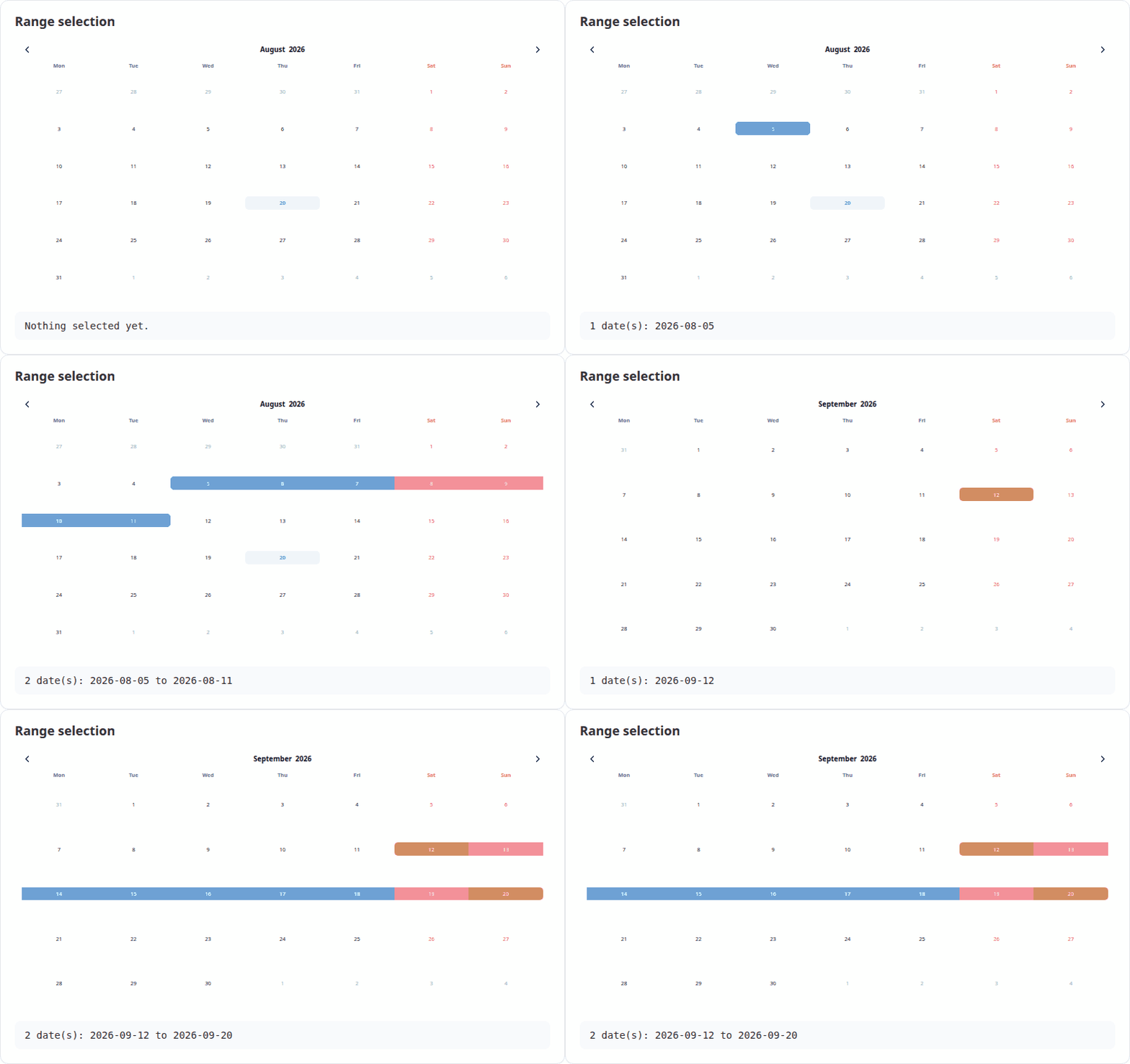
output$cal <- renderVanillaCalendar(
  VanillaCalendar(list(selectionDatesMode = "multiple-ranged"))
)
output$out <- renderText(paste(format(input$cal_selected), collapse = " to "))
A date picker, not a wall of calendar
Set inputMode = TRUE and the widget renders a text box that opens the
calendar as a popup, filling the box with the chosen date. Pair it with
height = "auto". See the upstream
input mode docs.
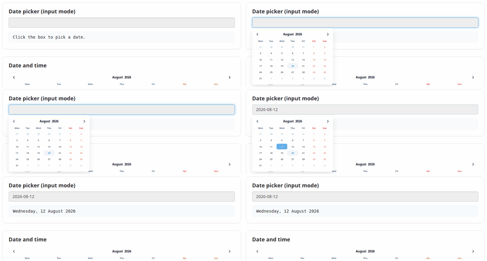
VanillaCalendar(
  options = list(inputMode = TRUE, selectionDatesMode = "single"),
  height = "auto"
)
Time
selectionTimeMode = 24 (or 12) adds a time picker below the dates. The
chosen time arrives in input$<id>_time as a string such as "14:30". The
timeMinHour, timeMaxHour and timeStepMinute options constrain it.
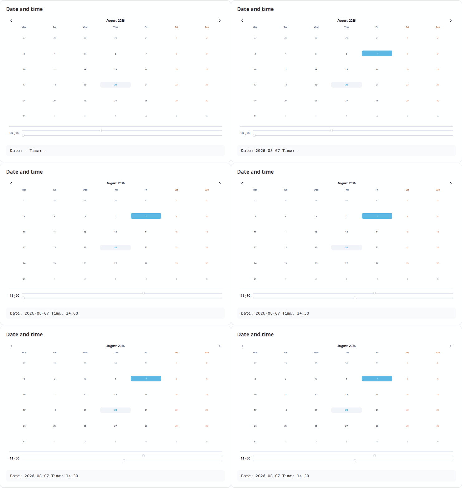
VanillaCalendar(list(selectionTimeMode = 24, selectedTime = "09:00"))
Months and years
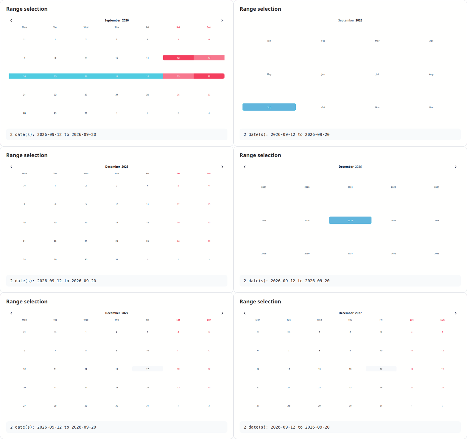
Clicking the month or the year opens a picker for it. Both are reported to Shiny, with months as 1-12 rather than the JavaScript 0-11.
Themes, changed without re-rendering
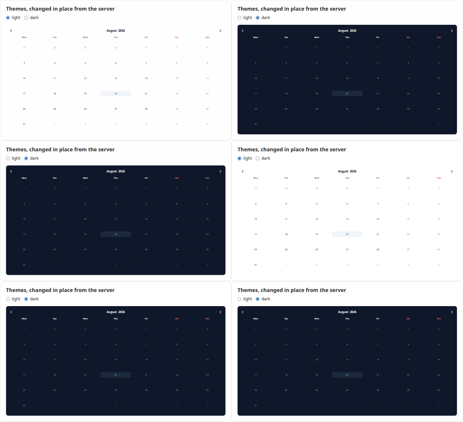
VanillaCalendarProxy() reaches a calendar that is already on the page, so
options can be changed in place — the calendar keeps its selection, position
and focus instead of flickering back to its initial state. Only the parts you
are actually setting change; pass reset to clear anything else.
observeEvent(input$theme, {
  vcSet(VanillaCalendarProxy("cal"), list(selectedTheme = input$theme))
})
The proxy verbs mirror the library's instance methods:
| Function | Does |
|---|---|
vcSet(proxy, options, reset) |
Apply new options |
vcUpdate(proxy, reset) |
Re-render with the current options |
vcShow(proxy) / vcHide(proxy) |
Show or hide a popup calendar |
vcDestroy(proxy) |
Remove the calendar |
selectedTheme accepts "light", "dark" or "system". In system mode the
theme is read from the attribute named by themeAttrDetect, which defaults to
"html[data-theme]"; bslib apps should set
themeAttrDetect = "html[data-bs-theme]" to follow the app.
Shiny inputs
For an output with id "cal":
| Input | Type | Set when |
|---|---|---|
input$cal_selected |
Date vector |
A date is clicked |
input$cal_selected_month |
integer, 1-12 | A month is chosen |
input$cal_selected_year |
integer | A year is chosen |
input$cal_displayed |
Date, first of the month |
The arrows are used |
input$cal_time |
character, e.g. "14:30" |
The time changes |
input$cal_week |
list of week and year |
A week number is clicked |
input$cal_ready |
TRUE |
The calendar has initialised |
Custom JavaScript
Callbacks are options like any other, passed with htmlwidgets::JS(). They run
in addition to the built-in handlers above, so adding one does not cost you the
matching Shiny input:
VanillaCalendar(list(
  onClickDate = htmlwidgets::JS("function(self) { console.log(self.context.selectedDates); }")
))
The full callback list — onClickWeekDay, onCreateDateEls, onChangeTime
and the rest — is in the
upstream reference.
Learn more
vignette("VanillaCalendar")— a guided tour of the widgetvignette("shiny")— using the widget in Shiny apps- Vanilla Calendar Pro documentation — the option reference this package passes through to
Licence
GPL (>= 3). The bundled Vanilla Calendar Pro library is MIT licensed,
copyright Yury Uvarov; its licence ships in
inst/htmlwidgets/lib/VanillaCalendar-3.2.0/LICENSE.